iScreen 博客

最新资讯、技巧和教程,助你打造个性化手机桌面。紧跟最佳实践与潮流趋势。

Best Weather Widgets for iPhone: Beautiful & Functional Options

Best Weather Widgets for iPhone: Beautiful & Functional Options

2026/6/4 16:54
A weather widget on your iPhone turns a quick glance into a full read on the day: temperature, the next hour of rain, sunset, and what to wear before you even open an app. Most guides stop at “touch and hold the Home Screen.” This one go further. You’ll set weather up across all three surfaces of your phone, pick a widget that actually fit how you live, fix the one that mysteriously vanished after an update, and understand why it suddenly looks like frosted glass in iOS 26. Here’s the idea worth stealing: stop thinking of “the weather widget” as one thing. On a modern iPhone you’ve three places to show weather, and each answers a different question. We call it the 3-Surface Weather Setup, and it’s the backbone of this guide. 📐 The 3-Surface Weather Setup Home Screenthe daily dashboard (forecast at a glance, multiple cities) Lock Screenthe zero-tap check you see 80+ times a day StandBythe bedside or desk view while your iPhone charges on its side How to Add a Weather Widget to Your iPhone Home Screen This is the part everyone searches for first, so let’s make it foolproof. The native Weather app already includes Home Screen widgets, so you don’t need to download anything to get started. Touch and hold an empty area of your Home Screen until the apps start to jiggle. Tap the Edit button (or the +) in the top corner, then tap Add Widget. Search for Weather in the widget gallery. Swipe through the sizes, then tap Add Widget on the one you want. Drag it where you want it and tap Done. To change the city it show, touch and hold the widget, tap Edit “Weather” (or Edit Stack if it’s in a group), choose My Location or search for a city, then tap outside the widget to finish. Want both your home city and a trip destination? Apple lets you add more than one Weather widget, so you can watch two forecasts side by side. 💡 Pro Tip Drop the Weather widget into a Smart Stack and turn on Smart Rotate and Widget Suggestions. iOS then surfaces the forecast right when you tend to check it (your morning commute, say) and tucks it away the rest of the day. Weather Widget Sizes Explained: What Each One Shows Picking a size is really picking how much information you want without tapping in. Bigger isn’t always better; a small widget you actually read beats a large one that crowds out your apps. Here’s what each native Weather widget surfaces. Widget size What it shows Best for Small (2×2) Current temperature, conditions, high/low A clean home screen where weather is one tile among many Medium (4×2) Current conditions plus an hourly forecast strip Knowing when rain starts or stops today Large (4×4) Hourly plus a multi-day outlook, often with precipitation, feels-like, and more detail Planning the week without opening the app Lock Screen (inline / circular) Temperature, conditions, or a single metric like UV or air quality A zero-tap glance every time you wake the phone Rule of thumb: if you check weather to decide what to wear, a small or medium widget is plenty. If you check it to decide what to plan, go large. Many third-party apps add extra fields here, wind, humidity, sunrise and sunset, air quality, which is exactly where the “best widget” question gets interesting. Add Weather to Your Lock Screen and StandBy Almost everyone sets up the Home Screen widget. Yet the other two surfaces are where the real payoff live, because you see your iPhone Lock Screen dozens of times a day without ever unlocking. Lock Screen weather (the zero-tap check) Touch and hold your Lock Screen, then tap Customize (tap + to make a new one). Tap the widget area beneath the clock. Choose Weather and add the temperature, conditions, or a detail like UV index. Tap Done. StandBy weather (the nightstand view) When you turn your iPhone on its side while it charges, StandBy mode turns it into a small smart display. Swipe to the widget face, touch and hold, and add a Weather widget so the forecast greets you in the morning before you’ve picked up the phone. It’s the most underused weather surface on iOS, and it costs nothing to set up. ⚠️ Important All three surfaces pull from the same Location Services permission. If one shows the wrong city or goes blank, the fix is almost always location — more on that below. The Best Weather Widgets for iPhone in 2026 Apple’s native widget is reliable and free, but it’s deliberately minimal. If you want richer data, smarter layouts, or just more personality, a third-party app is the move. Here’s an honest read on the names that keep coming up among iPhone users. App What it’s good at Cost Apple Weather (native) A free, accurate starting point, now richer after Apple folded in Dark Sky data. Keep it if you mainly want temperature and rain. Free CARROT Weather The power user’s pick: deeply customizable widgets, radar, and a snarky personality you can dial up or off. Reddit’s r/ios crowd keeps calling it “the best by far.” Free + paid tiers Hello Weather Clean, calm, and glanceable, with a choice of forecast data sources. A 2025 review crowned its widgets for design. Freemium The Weather Channel / WeatherBug Built for severe-weather alerts and radar when storm tracking matters more than aesthetics. Free (ad-supported) “The No. 1 reason Hello Weather tops my list is its clean, concise, glanceable design, whether in-app or through its widgets.” Yahoo Tech review, 2025 ⚠️ Common mistake Don’t choose a weather widget on looks alone. Two widgets can look identical and pull from different forecast models, refresh on different schedules, and disagree by several degrees. Check the data source and how often it updates before you commit. Free vs Paid Weather Widgets: What You Actually Get Most of these apps are free to install, then ask for a subscription to unlock the good widgets. Before you pay, it helps to know what the money actually buy, and to clear up a pricing point that confuses a lot of people. Feature Free tier Paid subscription Basic widget sizes Yes Yes Extra layouts & customization Limited Full Radar, alerts, longer forecasts Often locked Unlocked Ads removed No Usually yes The pricing confusion is worth flagging. CARROT Weather, for example, has more than one paid tier: an entry-level premium plan reported at around $4.99/year by The Sweet Setup, and a higher “ultra” tier that costs roughly ten times that. People who quote “$50 a year” are usually looking at the top plan, not the one most users need. (Prices were accurate as of early 2026 and change often, so confirm in the App Store before subscribing.) The honest answer: if the free native widget covers your needs, keep it. Pay only when you want a specific thing the free tier won’t give you, better radar, a custom layout, or a look that matches your aesthetic. How to Make an Aesthetic Custom Weather Widget Here’s the gap the big weather apps leave open: they give you their design, not yours. If you’ve built a coordinated theme and the stock weather widget clashes with it, a customization app let you style the widget to match. That’s where custom iPhone widgets come in. In iScreen’s widget library, an aesthetic weather widget is less about more data and more about fit: you pick the background color, the font, and how minimal the layout is, so the forecast read like part of your wallpaper instead of a sticker on top of it. A few combinations our users reach for again and again: ✔Minimal monoa single temperature number on a flat background, paired with a clean wallpaper. ✔Pastel matchwidget tint pulled from your wallpaper’s palette so nothing fights for attention. ✔Small-and-stackeda tiny weather tile beside a clock or a countdown widget in a tidy two-up layout. The principle is the same one behind any good home screen ideas: pick one accent color and let the weather widget echo it, rather than introducing a new one. A widget that belongs to your theme always looks more deliberate than the default. Weather Widget Not Working? Fixes for the “Disappeared” Widget If your weather widget went blank, froze on yesterday’s forecast, or vanished after an update, take a breath: this is common and almost always fixable in a couple of minutes. Where Did My Weather Widget Go? Most of the time, it didn’t get deleted, an iOS update reset it. Major updates can rearrange the Home Screen, clear a widget’s saved location, or pause the permission it need to refresh. So the widget isn’t gone; it’s sitting there without the location access it needs to draw a forecast, which makes it look blank or stuck. That’s why re-adding it or re-granting location usually brings it straight back, no app reinstall required. ✔Check Location Services. Settings > Privacy & Security > Location Services > Weather. Set it to While Using the App (or Always) and turn on Precise Location. ✔Turn on Background App Refresh. Settings > General > Background App Refresh, so the widget can update when you’re not looking at it. ✔Re-add the widget. Remove it, then add it again from the widget gallery to force a fresh start. ✔For a blank Lock Screen weather wallpaper: touch and hold the Lock Screen, tap Customize, and re-accept the location prompt. iPhone users report this single step fixes the missing-location look. ✔Restart, then update. A quick restart clears most glitches; installing the latest iOS clears the rest. Work down that list in order and you’ll catch the cause well before the last step. To rebuild the widget exactly how you like it afterward, the same steps you used to customize your iPhone apply. What iOS 26’s Liquid Glass Means for Your Weather Widget If your weather widget suddenly looks translucent, refracting the wallpaper behind it, that’s Liquid Glassthe headline design change in iOS 26. Widgets, icons, and the Lock Screen now use a glassy material that bends light and adapts to whatever sits behind it. The weather widget is one of the most-cited examples because its background change with conditions. You’re not stuck with one look. To change how widgets and icons render, touch and hold the Home Screen, tap Edit, and switch the appearance between Default, Clear, and Tinted to suit your wallpaper. And if the glass effect ever hurts readability, you can tone it right down under Settings > Accessibility > Display & Text Size > Reduce Transparency. The practical takeaway for 2026: a weather widget’s legibility now depends on your wallpaper as much as the widget itself. If yours is hard to read on a busy background, switch to Tinted or turn on Reduce Transparency, and if you want a glass look that still read cleanly, a custom widget with a solid backing plate sidesteps the problem entirely. Liquid Glass made aesthetic widget choices matter more, not less. Frequently Asked Questions Q: Does the iPhone have a built-in weather widget? View Answer Yes — and it’s free. The built-in Weather app covers Home Screen, Lock Screen, and StandBy in several sizes. Q: Why is my iPhone weather widget not updating? View Answer Usually it’s a permission. Open Settings > Privacy & Security > Location Services > Weather and allow access, then turn on Background App Refresh. If it’s still stuck, remove and re-add the widget, then restart your phone. Q: Can I add a weather widget to my iPhone Lock Screen? View Answer Yes, and it’s one of the most useful places to put it. Touch and hold the Lock Screen, tap Customize, then tap the widget area beneath the clock and choose Weather. You can show the temperature, current conditions, or a single detail like UV index — whatever you want to read without ever unlocking the phone. Because you wake your screen dozens of times a day, this becomes your real weather check. Q: What is the best free weather widget for iPhone? View Answer For most people, Apple’s own widget wins on value — accurate and built in. CARROT and Hello Weather also have free tiers worth trying. Q: How do I get a bigger weather widget on my iPhone? View Answer You can’t stretch an existing widget, so add a fresh one in the size you want. Touch and hold the Home Screen, tap Add Widget, search for Weather, then swipe through the previews until you reach the large (4×4) option and tap Add Widget. The large size packs in an hourly strip plus a multi-day outlook, so you get the whole picture without opening the app. Drag it into place and tap Done. Q: How do I change the location on my weather widget? View Answer Touch and hold the widget, tap Edit “Weather” (or Edit Stack), tap My Location, then search for and pick the city you want. Tap outside the widget to save. You can also add a second Weather widget for a different city. Why We Wrote This Guide iScreen builds iPhone customization tools, so we spend our days watching how people set up widgets, including where the weather widget breaks. This guide pull together Apple’s official steps, real fixes iPhone users shared for the “disappeared” widget, and what iOS 26’s Liquid Glass changes, so you can set weather up once across all three surfaces and stop fiddling with it. Want a weather widget that matches your wallpaper instead of fighting it? Build your own with iScreen → References & Sources Use Weather widgets on iPhoneApple Support Add, edit, and remove widgets on iPhoneApple Support Create a custom Lock Screen on iPhoneApple Support How to customize your iPhone Home Screen for iOS 26’s Liquid GlassTechCrunch iOS 26 setting to customize the Liquid Glass design (Reduce Transparency)CNET Related Articles How to Add a Countdown Widget on iPhone iPhone Home Screen Ideas StandBy Mode Widgets for iPhone Dynamic Island Widgets & Animations
Best Countdown Widget Apps for iPhone: Track Events on Your Home Screen

Best Countdown Widget Apps for iPhone: Track Events on Your Home Screen

2026/6/3 16:39
Want a countdown widget for iPhone that shows the days until a trip, a birthday, or a deadline right on your screen? Here’s the part most guides skip: iOS doesn’t ship a real “days-until” countdown widget of its own. Good news: adding one takes about a minute once you know where to look. This guide show you how to put a countdown on your Home Screen, Lock Screen, and even StandBy mode, which apps are worth installing, what you can get for free, and how to make the whole thing match the rest of your setup. The short version — the 3-Surface Countdown Setup Home Screen, a medium widget you glance at while planning your day. Lock Screen, a small widget under the clock for a no-unlock peek (iOS 16 and later). StandBy, a full-screen countdown on your bedside charger (iOS 17 and later). Pick a countdown app, set your date once, then drop the same event onto whichever of these three surfaces you actually look at. Does the iPhone Have a Built-In Countdown Widget? Not really, and this trips a lot of people up. Apple’s stock Clock app has a Timer, but a timer count down minutes and seconds for a single session, it can’t tell you “42 days until the wedding.” The Calendar widget shows your next few events with their dates, and the Reminders widget lists tasks that are due, yet neither one displays a running day counter on your screen. Apple’s own widget gallery, documented in the iPhone User Guide, simply doesn’t include a “days until” widget. So when people ask why the old standalone “Countdown” idea seems to have vanished, the answer is that it was never a permanent native feature to begin with. The countdown experience on iOS has always lived in third-party apps, and that’s by design, Apple opens the widget system to developers and lets them fill the gaps. That’s why every genuinely good iPhone countdown lives inside an app you install, not in a hidden Settings toggle. 💡 Pro Tip If all you need is the next calendar event, the native Calendar widget is fine. If you want a big “12 days to go” number staring back at you, you need a dedicated countdown app — keep reading. How to Add a Countdown Widget to Your Home Screen (Step by Step) Adding a countdown widget to your iPhone Home Screen works the same way as any other widget. Your only extra step is configuring the event inside the app first, because the widget pulls its date from there. Install a countdown app from the App Store (see the picks below) and open it once. Create your event inside the app, name it, set the target date, and pick a color or photo if the app allow. Long-press an empty spot on the Home Screen until the icons start to jiggle. Tap the + button in the top-left corner to open the widget gallery. Find the app you just installed and tap it. Choose a size, small, medium, or large, then tap Add Widget. Long-press the new widget and tap Edit Widget to pick which countdown it shows. Drag it into place and tap Done. Step 7 is the one people miss. A freshly added widget often shows a blank or default countdown until you open Edit Widget and choose the specific event, without that, it sits there looking broken. That single tap is why a setup someone called “impossible” usually takes ten more seconds to finish. ⚠️ Common Mistake If the widget won’t update, check Low Power Mode. It throttles background refresh, so a day-counter can lag behind by a day until you open the app. Turning Low Power Mode off, or opening the app each morning, fixes it. If you want the cleanest possible result, set up your countdown alongside the rest of your layout. Our walkthrough on building an aesthetic iPhone home screen covers spacing and theming so the counter doesn’t clash with everything around it. How to Add a Countdown Widget to Your Lock Screen Yes, you can put a countdown on your Lock Screen, and it’s genuinely useful because you see it every time you pick up your phone, no unlock required. This needs iOS 16 or later, which is when Apple added Lock Screen customization and widgets. Can I have a countdown on my iPhone Lock Screen? You can. Touch and hold the Lock Screen, tap Customize, then choose Lock Screen. Tap the widget area below the clock (or the slot above it for the inline date row), pick your countdown app from the list, and add its widget. Lock Screen widgets are small by nature, so they show a tight number like “9 days” rather than a full label. Tap Done and the countdown rides along on every wake. One honest caveat from real users: Lock Screen widgets don’t always refresh the instant the day rolls over. On the r/ios forum, people have noted that clock and weather widgets sometimes wait until the next unlock to update. A countdown can behave the same way, so if it looks a day off first thing in the morning, a quick tap to wake-and-unlock usually syncs it. If you want a deeper walkthrough of styling that screen, see our guide to the iPhone Lock Screen widget setup. Countdowns on StandBy and the Dynamic Island This is the surface almost every “best countdown widget” article forgets. StandBy turns your iPhone into a bedside display while it charges on its side, and a countdown is one of the things it can show full-screen. It needs iOS 17 or later. Per Apple’s StandBy guide, you turn it on in Settings, connect a charger, set the phone on its side, and press the side button, then swipe to the widgets view and pick your countdown. Why bother? Because a countdown you’ve to dig for is a countdown you forget. On a nightstand charger, a “5 days until vacation” panel is the last thing you see at night and the first thing in the morning. StandBy even has a Night Mode that tints the screen red in low light so it isn’t glaring at 3 a.m. On iPhones with an Always-On display, the panel just stays put; on other models, a tap or a nudge of the table wakes it. “We tell people to stop thinking of a countdown as one widget and start thinking of it as one event shown on three surfaces. The Home Screen is for planning, the Lock Screen is for a quick glance, and StandBy is for ambient awareness while you charge. Set the date once, place it three times.” The iScreen design team, on building widgets across iOS surfaces Live Activities and the Dynamic Island handle the short-term end of things, an event happening today or in the next few hours can ride in the Dynamic Island. For multi-day or multi-week countdowns, the widget surfaces above are the right home. Best Countdown Widget Apps for iPhone (2026) There are dozens of countdown apps, and most do the basics fine. Where they actually differ is how much you can customize, which surfaces they support, and what hides behind a paywall. Here’s an honest comparison of common picks. App Free tier Surfaces Best for iScreen Yes Home, Lock, StandBy Matching the countdown to a full themed setup Pretty Progress Limited Home, Lock Progress-bar style countdowns Widgetsmith Yes (ads) Home, Lock All-purpose widgets, not just countdowns Countdown Widget & Counter Limited Home, Lock Minimalist single-event counters Pick based on what you actually want: a plain number, a progress bar, or a counter that blends into a designed Home Screen. If aesthetics matter to you, an app that also handle wallpaper, icons, and themes saves you juggling three separate tools. You can see how the pieces fit together with the iScreen iPhone widget app. Are There Free Countdown Widgets? Plenty of countdown widgets are free, and a free one is enough for most people tracking a single event. A trade-off show up when you want more: many apps cap the number of countdowns, lock the nicer fonts and backgrounds, or show ads until you upgrade. None of that stops you from getting a working “days until” widget on your screen at no cost. Usually free vs. usually paid Free: one or two countdowns, basic sizes, a handful of colors, Home and Lock Screen widgets. Paid: unlimited countdowns, custom fonts, photo backgrounds, ad removal, and extras like Apple Watch or StandBy styling. A reasonable plan: start free, live with it for a week, and only pay if you hit a wall, usually that’s wanting a third or fourth countdown, or wanting the widget to match a specific palette. How to Customize a Countdown Widget to Match Your Aesthetic A countdown widget that clashes with your wallpaper looks worse than no widget at all. Fixing that means treating the counter as one element of a single design, not a sticker slapped on top. Most apps let you change four things: the background (solid, gradient, or your own photo), the font, the text color, and what units show (days only, or days plus hours). A simple rule keep it clean: borrow your two main colors from the wallpaper and let the countdown number be the one accent that pops. If your wallpaper is muted, a single bold number reads instantly; if it’s busy, a semi-transparent background behind the number stop it from disappearing. For couples syncing the same date, a trip or an anniversary, paired widgets keep both phones in step; our couple widgets setup is built for exactly that. Once the countdown look right, it’s worth carrying the same palette across your icons and theme. The iScreen customize your iPhone home screen guide and our theme tools handle that part so the whole screen feel intentional. Popular Countdown Types: Vacations, Weddings, Holidays and Exams The way you set up a countdown depend on what you’re counting toward. A few patterns cover most cases: ✔ A vacation is a single one-time event, and the most common reason people search for a countdown widget at all. A photo of the destination as the background makes it hit harder. ✔ Weddings and anniversaries work best set to repeat yearly, so the anniversary version resets on its own after the date passes. ✔ Holidays like Christmas, New Year, and Halloween drive huge seasonal spikes; a recurring holiday countdown saves you re-creating it every year. ✔ Exams and deadlines deserve a stark days-left number on the Lock Screen as a quiet motivator, no app to open, just a reminder every time you reach for your phone. One decision matter most here: one-time versus recurring. Get that wrong and a holiday counter show “−14 days” in January instead of resetting. Most apps put a “repeat yearly” toggle right next to the date field. How to Choose the Right Countdown Widget Setup Instead of asking “which app is best,” ask “where do I actually look, and what am I counting?” Match your answer to the table below. Your situation Surface Widget size Why One big event you obsess over Lock Screen + StandBy Small Maximum glances, zero effort Several events at once Home Screen Medium or large Room to list multiple dates Aesthetic-first home screen Home Screen Medium Blends into a themed layout Bedside / charging routine StandBy Full screen Ambient, last-thing-you-see If you’re not sure, default to the Lock Screen. It costs nothing in Home Screen real estate, you see it constantly, and you can always add the Home Screen or StandBy version later. Need ideas for the rest of the layout? Our iPhone home screen ideas are a good starting point. What iOS 26 Changes for Countdown Widgets iOS 26 shipped in September 2025 with the biggest visual change in years: a translucent “Liquid Glass” design that runs across the Lock Screen, Home Screen, and widgets, described in Apple’s iOS 26 announcement and the official iOS 26 feature list. For countdowns, that means your widget now picks up the same glassy, tinted look as the rest of the system, so the “match your aesthetic” advice above matters more than it used to, because a counter that ignores the new styling stand out for the wrong reasons. Under the hood, Apple’s developer session “What’s new in widgets” from WWDC25 extended WidgetKit and Live Activities to more places, CarPlay, the Mac, watchOS, and visionOS, and improved how widgets push updates. Practically, that points one way: a countdown you set on your iPhone is going to follow you onto more screens, and it’ll refresh more reliably than the older “wait for the next unlock” behavior some Lock Screen widgets still show. If you’re setting up a countdown in 2026, two moves future-proof it. First, choose an app that already support StandBy and Lock Screen widgets, not just the Home Screen, that’s where Apple keeps adding room. Second, lean into the Liquid Glass look rather than fighting it, so your counter ages well as the rest of your screen adopts the same style. Frequently Asked Questions Why was the Countdown app removed? View Answer There was never a permanent native “Countdown” app or widget built into iOS — countdowns have always come from third-party apps. Individual apps do get pulled or renamed in the App Store over time, but the day-counter feature itself was never an Apple stock feature that could be “removed.” So if an app you relied on disappeared, the answer isn’t a missing iOS setting; it’s installing one of the current countdown apps and rebuilding your event there. Your other widgets stay exactly as they were. Does the iPhone Clock app have a countdown widget? View Answer No — its Timer counts down a single session in minutes and seconds, never “days until” a future date. How do I edit or change a countdown widget after adding it? View Answer Long-press the widget on your Home Screen and tap Edit Widget to switch which event it shows or change its style. To change the date itself, open the app and edit the event there — the widget updates automatically. Can I put a countdown widget on Android too? View Answer Yes, Android has its own countdown widgets through Google Play apps, and the long-press-to-add flow is similar. The steps in this guide are specific to iPhone, including the Lock Screen and StandBy parts, which Android handles differently. Do countdown widgets drain iPhone battery? View Answer Barely — a day-counter refreshes once a day, so its battery cost is tiny. Low Power Mode actually slows that refresh, which is why a counter can look a day behind. How many countdowns can I add to one widget? View Answer A small widget usually shows one event, while medium and large sizes can list several at once. Total countdowns you can create is often where free apps draw the line and ask you to upgrade. Build a countdown that matches your whole screen iScreen puts countdown widgets on your Home Screen, Lock Screen, and StandBy, and styles them to match your wallpaper, icons, and theme. Try the iScreen widget app → How We Put This Guide Together The setup steps here were checked against Apple’s own iPhone User Guide for widgets, Lock Screen customization, and StandBy, then cross-referenced with real iPhone owners describing quirks like Lock Screen widgets that don’t refresh until the next unlock. We build iScreen, so we test countdown widgets across Home Screen, Lock Screen, and StandBy on current iOS 26, which is why the “three surfaces” framing runs through the whole article. References & Sources Add, edit, and remove widgets on iPhoneApple Support, iPhone User Guide Customize the iPhone Lock ScreenApple Support, iPhone User Guide Use StandBy on iPhoneApple Support, iPhone User Guide Apple elevates the iPhone experience with iOS 26Apple Newsroom New features available with iOS 26Apple What’s new in widgets (WWDC25)Apple Developer Related Reading iPhone widget app iPhone Lock Screen widgets StandBy mode widgets Aesthetic iPhone home screen ideas Couple widgets for iPhone
Aesthetic iPhone Home Screen: The Ultimate Design Guide

Aesthetic iPhone Home Screen: The Ultimate Design Guide

2026/6/3 16:08
An aesthetic iPhone home screen isn’t about adding more stuff. It’s about three things agreeing with each other: the wallpaper, the app icons, and the widgets. Get those three to share one mood and a tight color story, and almost any layout looks intentional. This guide walks you through eight aesthetic styles, shows you how to assemble each one, and then covers the new iOS 26 icon looks that landed in 2026. Most of the “aesthetic home screen” tutorials still floating around were shot on iOS 14 back in 2020. Buttons moved, icon options changed, and Apple now lets you recolor icons without a single workaround. So we rebuilt the whole process for the current iPhone, kept what still works, and flagged the parts that quietly broke. What you’ll set up in this guide A wallpaper that anchors your color palette App icons that match (the native iOS 26 way and the custom-image way) Two or three widgets that look good without crowding the grid A layout with breathing room instead of clutter What Actually Makes a Home Screen Look “Aesthetic”? A home screen reads as aesthetic when every element look like it was chosen by the same person on the same afternoon. There are only four levers you control: the wallpaper (your background), the app icons, the widgets, and the layout. Everything else is noise. So why do some setups look styled and yours looks busy? Usually it’s color. Our eyes read a cohesive palette as “designed” and a rainbow of default icons as “default.” That single insight is doing most of the work in every Pinterest screenshot you’ve ever saved. 💡 The 3-Color Rule Pick no more than three colors for the entire home screen — usually one background tone and two accents. Your wallpaper, icons, and widgets all pull from that set. Once a fourth bright color sneaks in, the screen starts to look cluttered instead of curated. It is the fastest fix for a screen that feels “off” but you can’t say why. Here’s the trap nobody mentions: chasing looks at the expense of use. A popular sentiment in the iPhone setup community sums it up well. “Functionality beats aesthetics. People clutter the home screen with custom icons and widgets, then can’t find the app they actually open twenty times a day.” A widely upvoted post in r/iOSsetups Takeaway: beauty and usability aren’t enemies. Decide your three colors first, keep the apps you use daily on page one, and let the design serve the way you already use your phone. 8 Aesthetic Styles to Choose From (Find Your Vibe) Before you touch a single setting, choose one vibe and commit to it. A minimalist home screen and a Y2K home screen pull from opposite ends of the design world, and mixing them is exactly what makes a screen look unfinished. Explore the eight styles below, each consistently look good on iPhone, with the palette and wallpaper type that defines it. Aesthetic Core palette Wallpaper type Best if you want… Minimalist Off-white, grey, black Solid or soft gradient A calm, clutter-free phone Pastel / soft Cream, blush, sage Gradient or watercolor A cute, gentle look Y2K Hot pink, lime, chrome Glossy, sticker-style A bold, nostalgic 2000s feel Preppy Bright multicolor, white Pattern or collage A fun, energetic grid Dark / moody Charcoal, deep blue, plum Dark photo or solid black An OLED-friendly, sleek look Coquette Pink, ivory, red bows Soft, ribbon motifs A romantic, girly theme Cottagecore / natural Moss, tan, terracotta Nature photo or illustration A warm, earthy mood Cyberpunk / neon Black, neon cyan, magenta Dark city or glow art A high-contrast, techy edge If you can’t decide, default to minimalist. It’s the most forgiving aesthetic on iPhone because a neutral palette hides mismatched icons better than a loud one, and it ages well when the trend cycle move on. Whatever you pick, write your three colors down before the next step, they’re the rule everything else follows. Need more inspiration first? Our roundup of iPhone home screen ideas shows full setups for each of these styles. Start With the Wallpaper (Your Aesthetic Foundation) Pick the wallpaper first, then build everything else to match it. Your background covers the most screen area, so it sets the palette your icons and widgets have to live inside. Choosing icons before the wallpaper is the most common reason a setup feel disjointed halfway through. For a clean, minimalist look, a solid color or a soft gradient keep icons readable and never fights with your widgets. For pastel, Y2K, or coquette, a patterned aesthetic wallpaper carries more of the personality, just keep the busiest part of the image away from the top two rows where your widgets and clock sit. iScreen’s aesthetic iPhone wallpapers are sorted by exactly these styles, including 4K and depth-effect backgrounds. Can you have multiple home screen wallpapers on an iPhone? Yes. Each Lock Screen you create can be paired with its own Home Screen background, and you can switch between them by long-pressing the Lock Screen and swiping. That means you can keep a pastel setup for daytime and a dark, moody one for night, and flip between them in two seconds. On iOS 26, the Lock Screen also moves the clock so it never hides the subject of your photo, and tilting the phone give the image a subtle 3D depth effect. Apple’s Lock Screen guide covers the setup. Customize App Icons to Match App icons are where a home screen go from “nice wallpaper” to “fully themed.” There are two routes, and picking the right one for your style saves a lot of frustration. Route one is native and fast; route two is unlimited but fussier. Route 1, native iOS 26 tinting (fast, no apps). On iOS 26, Apple added a real icon makeover: you can tint every icon a single color, or switch the whole grid to light, dark, or clear. The clear, color-matched icons are the signature 2026 look. To do it, long-press an empty spot to enter edit mode, tap Edit then Customize, and select Light, Dark, Tinted, or Clear. According to Apple’s official guide to customizing apps and widgets, the change apply to your whole layout at once. It’s the cleanest way to get a cohesive grid in under a minute. Route 2, custom image icons (unlimited, via Shortcuts). Here’s the catch most guides skip: iOS 26 tinting recolors Apple’s icons, but it can’t replace them with a custom picture. If you want hand-drawn or themed icons, you still build them through the Shortcuts app, create a shortcut that open the app, then assign your own image. iScreen’s aesthetic app icons packs do this assembly for you so you don’t make each one by hand. ⚠️ Know this before you commit to custom icons Shortcut-based icons come with three real trade-offs that users report constantly: a brief loading flash when you tap one (the screen flickers before the app opens), the loss of red notification badges, and occasional style inconsistency under iOS 26. If badges and instant launching matter to you, the native tinted or clear icons are the safer choice. Can you change the font on an iPhone home screen? Not the app-label font directly, iOS uses the system typeface for icon names and doesn’t expose a font picker for them. What you can change is the font inside your widgets. Widget apps let you choose typefaces for clock, date, and text widgets, so you get a custom-font feel up top even though the labels below stay standard. A common workaround for a true text-free look is to rename Shortcut icons with a single blank space, which hides the label entirely. Add Aesthetic Widgets (Beauty Plus Function) Widgets are the fastest way to make a home screen feel personal, and the easiest way to wreck it if you overdo them. Aim for one or two widgets that earn their space, something useful that also happens to match your palette. A wall of decorative widgets is just clutter with rounded corners. The aesthetic widgets that actually get used tend to fall into a few buckets: a photo widget for a favorite picture, a clock or weather widget styled in your accent color, a Smart Stack that rotates through a few at once to save space. Dedicated widget apps like Widgetsmith and iScreen make these stylish, color-matched widgets without any design skill, and the fun ones, distance widgets for couples or a desktop pet that lives on your screen. iScreen’s custom iPhone widgets include all of these, and the couple distance widgets are a popular starting point. ✔ Match the widget’s accent color to one of your three palette colors. ✔ Use one large widget as a focal point, not three competing for attention. ✔ A Smart Stack lets you keep several widgets in one slot and swipe between them, pin your favorite to the top. Takeaway: aim for a rhythm of sizes, one medium or large widget paired with a tidy grid of icons reads far better than widgets stacked top to bottom. Nail the Layout (Grid, Spacing, and Blank Space) Layout is the difference between “themed apps” and a home screen that actually look designed. It borrows a principle interior designers lean on: empty space is a feature, not wasted room. A few open slots make the icons you do keep feel deliberate. Build it around one idea per page. Page one is your daily drivers, the six to eight apps you open without thinking, plus a widget. Push everything else to a second page or, better, into the App Library by removing it from the home screen (long-press the app, tap Remove from Home Screen, and it stays installed, just hidden). This is the single biggest fix for a cluttered phone, and it directly answers the complaint behind half the “help, my screen is a mess” posts online. ✔ Do Leave a blank row or column for breathing room Keep one aesthetic per page Use the dock for your four most-used apps ✘ Avoid Filling every grid slot More than two widgets per page A fourth accent color sneaking in For more arrangement patterns, split layouts, single-app pages, and dock-only setups, our guide to aesthetic iPhone home screen layout ideas goes deeper on the grid itself. Put It All Together: Step-by-Step Setup Here’s the full sequence from a default iPhone to a finished aesthetic home screen. Following this order matters, each step set up the next, and doing it backward is why so many people give up halfway. How to make your iPhone aesthetic, step by step Pick a vibe from the eight styles above and lock in your three colors. Set the wallpaper that anchors that palette (Settings > Wallpaper, or long-press the Lock Screen). Style the iconstint or clear them in iOS 26, or apply a custom icon pack via Shortcuts. Add one or two widgets in a matching accent color. Clean the layoutdaily apps on page one, the rest to the App Library, a blank row for space. Review at arm’s lengthif anything jumps out as a clashing color, fix that one thing. Done manually, this takes most people thirty to sixty minutes the first time, mostly spent finding and assigning matching icons. The shortcut, if you would rather not build every icon by hand, is a one-tap theme kit. Apps like iScreen package a matching wallpaper, icon set, and widgets as a single theme, so step three through five collapse into one tap. iScreen lists more than 10,000 themes, 5,000 app icons, and 500 widgets across iPhone and iPad, which is what makes the assembled-kit route practical on any device instead of a weekend project. You can browse the full aesthetic iPhone theme library or follow the in-app how to customize your iPhone walkthrough. Skip the manual work, apply a full aesthetic theme in one tap. Download iScreen on the App Store → Get it on Google Play → What’s New and Trending for 2026 (iOS 26 and Beyond) This year’s biggest shift in aesthetic home screens came straight from Apple. the iOS 26 update, released in late 2025, rebuilt how icons look and pushed customization that used to need third-party apps into the operating system itself. If your reference photos are from 2023, they’re already a generation behind. Three iOS 26 changes are driving the 2026 look. First, icon tinting and the new clear, “Liquid Glass” icons, a translucent, color-matched grid is now the most-requested aesthetic, and Pinterest searches for “iOS 26 aesthetic” have climbed into the tens of thousands. Second, the smarter Lock Screen, where the clock repositions itself around your photo’s subject and tilts into a 3D effect. Third, beyond the home screen, the Dynamic Island and StandBy mode have become design surfaces of their own. The trend itself is splitting in two directions. One camp is going ultra-minimal, clear icons, a single solid wallpaper, no widgets at all. The other is going maximalist with animated Dynamic Island pets and a styled StandBy mode nightstand clock. Both are valid; pick the one that matches how you actually use your phone. Engadget’s iOS 26 customization walkthrough is a solid reference for the new icon control. If you’re refreshing your setup in 2026: start with the native iOS 26 clear or tinted icons before reaching for custom packs. It costs nothing, takes a minute, and gives you a current look you can build on later. Frequently Asked Questions How do you get an aesthetic iPhone home screen? View Answer Start by choosing one style and locking in three colors. Set a matching wallpaper, then recolor your icons — tint or clear them in iOS 26, or apply a custom icon pack through Shortcuts. Add one or two widgets in a matching accent color, and finish by cleaning up the layout: keep daily apps on page one and push the rest into the App Library. Cohesion comes from limiting your palette, not from piling on more icons and widgets until the screen looks busy. Can you change the font on an iPhone home screen? View Answer You cannot change the font on app labels — iOS keeps the system typeface there. You can change fonts inside widgets, so a custom clock or date widget gives you that styled-font look at the top of the screen. Do custom icons slow down or drain my iPhone? View Answer Shortcut-based custom icons don’t drain battery in any meaningful way, but they do add a brief loading flash when you tap one, and they hide the red notification badge. Apple’s native iOS 26 tint and clear icons have neither problem, because they restyle Apple’s own icons instead of routing through a shortcut. How do I reset my iPhone home screen? View Answer Open Settings, go to General, then Transfer or Reset iPhone, choose Reset, and tap Reset Home Screen Layout. This returns icons to the default Apple arrangement without deleting any apps or data. It’s the quickest way to start a new aesthetic from a clean slate. How do I add an app back to my home screen? View Answer Swipe left past your last page to open the App Library, find the app, then long-press it and choose Add to Home Screen — or just drag it out of the App Library onto the page you want. Is iScreen free to use? View Answer iScreen has a free tier with themes, icons, wallpapers, and widgets. A premium subscription unlocks the full library and works on both iPhone and Android. Why We Wrote This Guide We rebuilt this aesthetic iPhone home screen walkthrough specifically for iOS 26, because most tutorials still demonstrate the old iOS 14 steps where icon tinting and clear icons didn’t exist yet. Every setting path here was checked against the current iPhone, and the trade-offs of custom icons come from real iScreen users and the wider iPhone setup community, not a sales pitch. References & Sources What’s new in iOS 26Apple Support Customize apps and widgets on the Home ScreenApple Support Create a custom iPhone Lock ScreenApple Support How to customize your iPhone home screen with iOS 26Engadget Related Articles 20 Best iPhone Home Screen Ideas for 2026 Aesthetic iPhone Home Screen Layout Ideas Aesthetic iPhone Wallpaper Picks How to Change Your iPhone Home Screen Browse Aesthetic iPhone Themes
Minimalist iPhone Home Screen: Create a Clean, Distraction-Free Setup

Minimalist iPhone Home Screen: Create a Clean, Distraction-Free Setup

2026/6/1 11:56
A minimalist iPhone home screen should feel calm when you unlock your phone, but it still has to help you open the right app fast. Most minimalist setups fail for one of two reasons: they hide everything so well that daily tasks slow down, or they keep adding aesthetic widgets until the screen is busy again. Better path: fewer visible choices, enough contrast to read at a glance, and a layout you can keep for weeks. Quick Specs Best for: cleaner first page, fewer taps, less visual noise. Core rule: keep the first page to 8-12 visible app, widget, or shortcut slots. Best setup path: native iOS first, then Shortcuts, a launcher, or iScreen if you want themed icons, widgets, and wallpapers. Accessibility check: use readable text/icon contrast before choosing a color theme. Internal companion: browse iScreen’s 500+ home screen ideas when you want more visual examples. What makes a minimalist setup work? The 12-Slot Minimalist Grid Blank space without broken navigation Widgets that earn space Wallpaper, icons, and contrast Native iOS, Shortcuts, launcher, or iScreen The Tap-Value Filter Five mistakes to avoid What changes in 2026? FAQ What Makes a Minimalist iPhone Home Screen Work? Minimalist home screens are not just empty screens. Think of the first page as a small decision surface. When you unlock your iPhone, the first page should answer one question: what is worth doing now? Research on smartphone use is careful, not absolute. In a 2022 PLOS ONE study, smartphone notification sounds were linked with slower responses in its task, and a 2017 Frontiers in Psychology review connects phone habits with attention, memory, and distractibility limits. That does not prove a clean layout will fix screen time. Safer takeaway: fewer visual triggers and fewer notification cues are practical design goals. Wilmer, Sherman, and Chein’s useful lesson is restraint: the phone is a capable tool, but the way it is arranged can pull attention before you make a choice. Treat the Home Screen as a filter, not a gallery. Design the first page for action, not admiration. If a visual element does not help you choose, move it off the first page. Expert takeaway based on Apple HIG widget and icon guidance. Strong setups usually have four traits: one clear wallpaper, a limited icon set, 0-2 useful widgets, and a second place for everything else. That second place can be App Library, hidden Home Screen pages, Focus pages, Shortcuts, or a themed tool such as iScreen. Choose a Layout With the 12-Slot Minimalist Grid The 12-Slot Minimalist Grid is a simple test: count every visible icon, shortcut, widget, and folder on your first page. If the number is above 12, the screen is no longer minimal in practice, even if the colors are muted. Apple lets you move apps and widgets around the Home Screen, hide pages, and reset the Home Screen layout if the setup gets messy. Start with one of these nine layouts. Layout Slots Best use Risk 4-icon dock only 4 Phone, messages, browser, camera Too many hidden taps Dock plus one row 8 Simple daily phone Can become a dumping row One medium widget plus dock 6-8 Calendar, weather, battery, or tasks Widget becomes decoration Two small widgets plus dock 8-10 At-a-glance day planning Crowded top half Text launcher plus dock 5-9 Users who prefer verbs over app logos Extra app dependency Focus page 4-12 Work, study, travel, sleep prep Forgotten Focus settings Single folder hub 5 Neat look with backup access Folder becomes a junk drawer Wallpaper-first grid 4-8 Visual calm and lock-screen pairing Low contrast icons Theme set with matching icons 8-12 Aesthetic setup without a manual rebuild Theme looks better than it works If you want inspiration before you place anything, use iScreen’s home screen ideas as a gallery, then copy only the structure that fits your daily apps. Use Blank Space Without Breaking Navigation Blank space works when it creates pause. Blank space fails when it turns every normal task into a hunt. Apple’s App Library organizes apps into categories and can sit closer to the first page when you hide extra Home Screen pages. You can also choose whether new apps land on the Home Screen or go to App Library only. That gives you a clean native pattern: first page for essentials, App Library for the rest. Use this three-zone rule: Top zone: empty space, one widget, or one visual anchor. Thumb zone: the 4-8 actions you open many times per day. Hidden zone: App Library, Focus page, or search for rare apps. Scenario: For a student, the thumb zone might hold Calendar, Notes, Camera, and a study playlist. Social apps can stay in App Library so they remain available without sitting in the first unlock view. Scenario: For a designer, the first page might keep Camera, Photos, Notes, and one inspiration widget, while icon-heavy reference apps sit on a second page tied to a Work Focus. Scenario: For a parent, a minimalist setup may still need Messages, Maps, Weather, and Photos up front. Minimal does not mean hiding the apps that reduce friction in real life. Keep Only Widgets That Earn Their Space Widgets are the easiest way to ruin a clean screen while believing you made it more useful. Apple describes widgets as a way to show current information and quick focused interactions. Apple HIG widget guidance also says a useful widget should show timely, glanceable content and avoid acting like a duplicate app icon. For a minimalist iphone setup, every widget needs a job. If the job is only “looks nice,” move it to a Lock Screen, second page, or themed gallery. Widget type Keep when Remove when Calendar It changes your next action today. You check Calendar from notifications anyway. Weather You leave home often and need conditions fast. Only fills a visual gap. Battery You use AirPods, watch, or other devices daily. You only need phone battery. Tasks Shows the next 1-3 actions. Shows a long guilt list. Photo Has emotional value and does not compete with icons. Lowers icon readability. Launcher Replaces several app icons with clear actions. Duplicates the dock. Smart Stack It rotates between truly relevant widgets. You swipe it without acting. Screen Time Seeing screen time stats changes your behavior. Becomes background noise. Music Audio is a daily control need. Pulls you into browsing. As a practical rule, use one medium widget or two small widgets. Apple lists many iPhone widget sizes by device, with examples such as small 170 x 170 pt and medium 364 x 170 pt on larger iPhone displays. That is a real budget, not free space. Browse iScreen widgets when you want themed options, but choose by purpose first: calendar, weather, battery, tasks, or a small launcher. Match Wallpaper, Icons, and Contrast Before Color Minimalist app icons iphone users often start with color. Start with contrast instead. Pale wallpaper with pale icons may look good in a screenshot and fail in sunlight. WCAG 2.2 sets a 4.5:1 minimum contrast ratio for normal text and a 7:1 enhanced contrast ratio. W3C’s non-text contrast guidance uses 3:1 for user interface components and graphical objects. Your Home Screen is not a website, but these ratios are a useful guardrail for labels, glyphs, and widget text. Apple HIG’s app icon guidance also favors simple, recognizable icons and warns that text inside icons is often too small to read. That matters when using grayscale icons or clear icon styles. Engineering Note: Use 4.5:1 text contrast, 3:1 icon/UI contrast, a 1024 px icon source when making custom icons, and the 170 pt / 364 pt widget examples as hard space budgets. Check the same layout for 7 days before adding new widgets. Wallpaper Icon style Label style Verdict White or cream Black line icons Dark labels Safe and readable White or cream Pastel icons Light labels Usually too soft Black White icons White labels Strong minimalist look Black Gray icons Dim labels Test in daylight Photo Solid icon tiles Default labels Best if photo has quiet areas Photo Transparent icons Hidden labels Clean but fragile Gradient Monochrome icons Short labels Works when gradient is subtle Pattern Large glyph icons No labels or high contrast labels Use carefully Single color Matching theme pack System labels Fastest to keep neat iScreen offers 10,000+ aesthetic themes, 5,000+ icons, and 500+ interactive widgets across iOS and Android, so you can test theme families without building every shortcut manually. For this article, the key is to choose fewer assets, not every matching asset. Try iScreen icons and iScreen wallpapers as paired sets. Then check the first page outside, at night, and in Focus mode before calling the setup done. Pick the Right Setup Path: Native iOS, Shortcuts, Launcher, or iScreen There is no single best way to customize a minimalist iphone home screen. Your right path depends on how much control you want and how much upkeep you can tolerate. Native iOS handles more than many people expect: App Library, hidden pages, widget editing, Focus pages, and Home Screen placement. Shortcuts add custom Home Screen icons and names from photos or files. Launcher apps can replace icons with text actions. iScreen is the path when you want themes, widgets, icons, and wallpapers from one place. Path Use when Best feature Watch out for Native iOS only You want the least upkeep. App Library, hidden pages, Focus pages Limited visual style control Shortcuts You want custom icons for a few apps. Custom Home Screen name and image Manual setup work Minimalist launcher You want action labels instead of logos. Text-based launcher behavior Another app to manage iScreen theme path You want a matching wallpaper, icon, and widget set. Theme, icon, widget, wallpaper library Choosing too many pieces Start with native iOS, then add one layer only if you know why you need it. If you simply want a clean visual set, browse iScreen themes. If the issue is too many apps, use App Library and the Tap-Value Filter first. Remove Apps With the Tap-Value Filter The Tap-Value Filter is a quick way to decide what stays visible. For every icon, widget, shortcut, and folder on page one, ask two questions: Does this save a tap, reduce a search, or prevent a mistake at least once a day? Would I still want this visible if the icon were plain gray? If the answer to both is no, move it off the first page. This is where screen time goals become concrete. Screen Time widgets can be useful if they change behavior. Placing a social app icon in the thumb zone is often the opposite: it lowers the cost of checking without asking whether you meant to open it. Apple’s Focus system can show a chosen Home Screen page while that Focus is on, and it can turn on by time, location, or app. Put work apps on a Work Focus page, travel apps on a Travel page, and entertainment apps outside the default unlock view. Run the Tap-Value Filter as a 7-day test. On day 1, move any app that fails both questions. On day 3, restore only the apps you searched for twice. On day 7, keep the final page unchanged for another week. This gives the layout time to prove whether it reduces friction or only looks cleaner. For rare apps, trust search and App Library. Clean iPhone home screen design is not a promise that every app disappears. Its real promise is that your first page stops acting like an app store. Fix the 5 Mistakes That Make Minimalist Setups Annoying 1. Hiding essential apps too deeply If an app solves a daily problem, hiding it three gestures away is not minimal. Keep it in the dock, a Focus page, or a reliable launcher. 2. Using low-contrast themes Grayscale can look calm, but grayscale plus a pale wallpaper can make labels and icons hard to read. Use the contrast matrix before finalizing dark and light wallpapers. 3. Keeping widgets for symmetry Apple’s widget guidance favors essential, glanceable content. Widgets that only balance the grid are decoration, not function. 4. Copying a screenshot without copying the routine A setup can look ideal on Pinterest or Reddit and still be wrong for your day. Match the layout to actual unlock moments: commuting, studying, work, errands, sleep prep. 5. Rebuilding too often Changing your setup every weekend can become another distraction. Choose one layout, use it for seven days, then move only the apps that caused real friction. What Is Changing in Minimalist iPhone Setups in 2026? Minimalist iPhone setup trends are moving away from one blank page and toward context-aware pages. Practically, that means fewer default choices and better switching, not more decoration. Expect more use of Focus pages, Smart Stacks, clear icon styles, tinted icon sets, and launcher-style text actions. Apple HIG’s app icon guidance now discusses multiple icon appearances such as default, dark, clear, and tinted variants, while still asking icons to remain recognizable. Keyword data also shows growing interest around minimalist iphone theme, while minimalist iphone widgets has lower current search volume. For this post, the lesson is simple: themes bring people in, but usability keeps the setup on the phone. Use iScreen’s customization guide if you want the step-by-step build path after choosing a layout. FAQ What is the best minimalist iPhone home screen layout? Dock plus one row is the best starting point: 4 dock apps and 4 apps above it. This gives you a calm first page, but it still leaves room for the actions most people need many times per day. If eight visible slots feel too tight, add one small widget or one extra row before you try a blank-screen setup. How many apps should be on a minimalist home screen? Keep 8-12 visible slots on page one. Count icons, widgets, shortcuts, and folders. Can I make a minimalist iPhone setup without third-party apps? Yes. You can use App Library, hidden Home Screen pages, widgets, Focus pages, and Shortcuts. Third-party tools help when you want themed icons, wallpapers, widgets, or a transparent text-based launcher, but the native path is enough for many clean setups. Are blank home screens useful? They can be, but only when you still know where key actions live. Blank pages with no navigation plan usually create friction. Blank top zones with a useful dock are easier to keep. What should I do with distracting apps? Move them out of the thumb zone first. Then put them in App Library, a folder on a later page, or a Focus-specific page. If that still fails, remove notifications before changing the layout again. Layout changes help most when they raise the effort of checking, not when they only make the icon less colorful. Build the Setup Faster With iScreen If you already know the layout you want, iScreen can help you pair the wallpaper, icons, and widgets without starting from scratch. The current iScreen library includes 10,000+ themes, 5,000+ icons, and 500+ widgets, with iOS and Android support. Browse themes, match icons, or start from 500+ home screen ideas. Related iScreen Guides iPhone Home Screen Ideas and Layouts iPhone Home Screen Layout Ideas How to Change Your iPhone Home Screen iPhone Widgets iPhone Wallpapers References and Sources Apple Support: Move apps and widgets on the iPhone Home Screen Apple Support: Add, edit, and remove widgets Apple Support: Find and use your apps in App Library Apple Support: Add a shortcut to the Home Screen Apple Support: Set up a Focus on iPhone Apple Human Interface Guidelines: Widgets Apple Human Interface Guidelines: App icons W3C WCAG 2.2 W3C Understanding SC 1.4.11: Non-text Contrast Upshaw et al. 2022: Smartphone notifications and cognitive control Wilmer, Sherman, and Chein 2017: Smartphones and cognition review iScreen homepage iScreen home screen ideas
20 Best iPhone Home Screen Ideas for 2026 (Aesthetic + Functional)

20 Best iPhone Home Screen Ideas for 2026 (Aesthetic + Functional)

2026/5/29 10:21
Home screen ideas work best when they are visual first and practical second: choose a mood, match the wallpaper, add only the widgets you will check, then place daily apps where your thumb already goes. iScreen keeps this page as a copy-ready gallery, with extra guidance for choosing a look before you start changing icons. Quick Specs: Home Screen Idea Picker Best page type: visual gallery with style filters and short decision copy. Best starting order: wallpaper, widget, icon, layout. Best first-page widget count: 0-3 visible widgets, or 1 Smart Stack when you want more data without crowding the screen. Best reader path: browse aesthetic home screen themes, choose a widget set, then match icons and wallpaper. Primary caution: do not create a second exact-match blog page for this keyword; this URL should stay the ranking target. Gallery-First Advantages The search results favor pictures, templates, videos, and community posts. This gallery lets users compare cute, minimalist, neon, brown, beige, blue, and black and white styles faster than a text-only article. Gallery-First Limits Too many choices can slow the decision. Add short chooser copy, a matrix, and a fix section so users can move from inspiration to a usable homescreen layout. Find a Home Screen Idea by Style The fastest way to choose a look is to start with style rather than app order. Wallpaper sets the mood, but the widget shape and app icon contrast decide whether the design still works after a week of use. iScreen’s live home screen gallery is built around 500+ aesthetic layouts to copy. Use it as the primary visual library, then let this guide narrow the field before you save a theme. Many users first collect aesthetic home screen ideas on Pinterest, then move to an app when they want pieces that actually fit together. Treat Pinterest as the mood-board step: find and save ideas, then return to iScreen for an app icon set, wallpaper, widget collection, and homescreen layout ideas that can be applied as one look. If you want to customize your home screen without starting from a blank grid, choose one saved idea and get creative only with the personal details. Style goal Choose this first Avoid this mismatch Cute Pastel wallpaper, rounded widgets, soft app icons Tiny line icons on a busy photo background Minimal Plain background, one calendar or weather widget, low-color icons Four different widget shapes on page one Y2K or neon High-contrast wallpaper, bright icon set, photo widget Low-contrast text widgets that disappear at night The 4-Layer Home Screen Formula A good iPhone home screen is not just an aesthetic choice. It is a four-layer system: wallpaper controls the color field, widgets control information density, icons control recognition speed, and layout controls muscle memory. This is where aesthetic iOS browsing turns into a real iOS home screen layout. One visual element sets the color, one widget gives daily information, one icon style keeps apps readable, and the App Library or default app drawer holds everything that does not need page-one space. “Choose the background first, then give widgets a job. The setup gets easier to keep when every icon and widget earns its place.” – iScreen Product Content Team, review note for this page Layer Decision Usability test Wallpaper Pick the visual mood before anything else. Can icon labels and widget text still be read? Widgets Add only data you check daily. Does it save an app open at least once per day? Icons Match contrast before matching color. Can you find Messages, Camera, and Phone in under 2 seconds? Layout Place daily apps on page one; move rare apps away. Does the page still feel calm after adding work apps? Engineering Note Apple’s icon guidance favors recognizable, simplified shapes and warns that too much detail can make an icon hard to read. For daily-use icon packs, keep the main symbol clear at small size, use enough background contrast, and limit page-one widgets to 0-3 blocks unless you use a Smart Stack. Apple states a Smart Stack can hold up to 10 widgets, but a first page still works better when only one stack or two single-purpose widgets are visible. 9 Home Screen Layout Ideas You Can Copy Use this matrix when you like too many home screen ideas and need a quick yes-or-no filter. Each row tells you what to pair, how many widgets to allow, and where to start inside iScreen. iScreen lists 10k+ aesthetic themes, 5k+ icons, and 500+ widgets for iOS and Android. That inventory is strongest when paired with a small choice rule, not random browsing. Style Wallpaper type Widget count Icon treatment Best user type Start here Minimal Plain gray or white 0-1 Thin monochrome Low-distraction users minimal wallpaper backgrounds Cute Pastel pattern 2-3 Soft rounded icons Photo and mood-board users cute home screen widgets Black and white Solid or grain texture 1-2 High-contrast glyphs Work phones iPhone app icons Beige or brown Paper, linen, or warm photo 2 Muted fill icons Study and planning users warm aesthetic themes Blue Sky, water, or gradient-free photo 1-3 White or navy icons Calm productivity users customize an iPhone home screen Neon Dark base with bright accents 1 Bold outline icons Music and gaming users Dynamic Island screen details Nostalgic Film, pixel, or retro image 2 Pixel or sticker icons Creative users StandBy-style widgets Couple Shared photo or soft illustration 1-2 Matching paired icons Long-distance partners couple widgets for home screens Lock-screen matched Same image family on both screens 1-2 Icon color pulled from wallpaper Users who change sets monthly lock screen ideas Widget Ideas That Deserve Space on Your First Page Apple describes widgets as glanceable information for the Home Screen, Lock Screen, or Today View. That means a widget should answer one small question without making you open an app: What is next? What changed? What do I want to remember? For a student planning a long class day, a small calendar widget, a medium photo widget, and a battery widget can be enough. Creators may prefer one large mood-board widget and no other blocks. Someone who wants less screen noise can put widgets into one Smart Stack, then keep page one mostly app icons. Widget type Use it when Skip it when Calendar Your schedule changes during the day. You only check dates once in the morning. Photo The page is meant to feel personal. It makes app names hard to read. Battery or weather You check status several times per day. It repeats data already visible elsewhere. How do I customize a home screen? Start with wallpaper, add widgets, then change icons. On iPhone, Apple says you can touch and hold the Home Screen background until items jiggle, then move apps or widgets to a new place or another page. On Android, Google says you can add apps, shortcuts, widgets, folders, and extra Home screens from the launcher. iScreen adds the style layer: browse a theme, save a widget set, and match the icon pack before arranging apps. App Icon and Wallpaper Pairing Rules Wallpaper is the largest color block on the phone. Icons sit on top of it all day. If both are detailed, the screen feels loud; if both are low contrast, apps become hard to find. Apple’s wallpaper guide covers suggested wallpapers, personal photos, filters, widgets, styles, controls, and photo shuffle. It also notes that 3D photo wallpaper needs iPhone 12 or later and an eligible photo. Keep home screen pairings flexible enough that a lock screen change does not break the app page. Pair a detailed photo background with plain icons. Pair a plain background with more expressive icon art. Use the same accent color on widgets and icon badges. Test the Camera, Messages, Phone, and Maps icons before changing every app. For users who change wallpaper often, build around a neutral icon pack from iScreen app icons. For users who care most about mood, start with aesthetic iPhone wallpapers and choose icons second. Can you change the font on an iPhone home screen? You can change the feel of a screen through wallpaper, widgets, icons, and app placement. System app-label font control is limited, so do not plan a full design around custom label type. If a theme needs a different typographic feel, use text inside a widget or a wallpaper design instead of relying on app names. How to Copy a Look in iScreen Copying a look is easier when you treat it as a set, not a pile of separate assets. Pick the theme, confirm the wallpaper, choose matching widgets, then apply the app icon set. Advanced users may mix a custom widget from Widgy with iScreen wallpaper or icons, but most readers should start with one stylish theme set. That leaves room for creative freedom without making every drag and drop decision from scratch. If you want a vibrant screen, choose one bold color and let the rest of the page stay quiet. Open the iScreen theme gallery and save 2-3 looks that match your style. Check whether each theme has the widget shapes you want for page one. Match the wallpaper to your lock screen or choose a separate lock screen from iScreen lock screen ideas. Apply app icons only after checking contrast on your wallpaper. Move daily apps to the lower half of page one and place rarely used apps in folders or the app drawer. iScreen supports iOS and Android. Android launchers vary, so follow the phone’s system steps when adding widgets or shortcuts, then use iScreen for the theme, widget, icon, and wallpaper assets. How to make an iPhone home screen unique? Unique iPhone home screen layouts need one clear personal signal. Use a photo widget, a color pulled from a favorite place, a small custom quote, or a lock screen match. Do not change every layer at once. Change the wallpaper and one widget first; if the page still feels right after a day, add icons. Fix Common Home Screen Problems Most home screen problems come from one of three causes: the setup is too crowded, the icons are hard to recognize, or the phone’s system layout changed after app installs. Fix the friction before changing style again. Problem Likely cause Repair move The page feels busy. Too many widget shapes. Remove one widget or combine data into one stack. Apps are hard to find. Icons are too similar. Keep daily apps in a clearer icon style. The setup breaks after downloads. New apps land in a visible area. Change where new apps go, or rebuild page one after install. Apple says resetting the Home Screen layout removes folders and arranges downloaded apps alphabetically after the apps that came with the iPhone. Use that only when a page is too tangled to repair by moving items. Need the bigger editing path? The home screen customization guide covers the full setup flow, while iScreen comparison notes help you decide whether to build a full theme or just change widgets. How do I get my homepage back to normal on my iPhone? First, remove the widget or icon pack that made the page hard to use. If the layout is still messy, move daily apps back to page one. Only then consider Apple’s reset option, because it removes folders and changes downloaded app order. Resetting is a last step, not the first repair. What Home Screen Styles Are Rising in 2026? Recent search data checked for this page points to two rising style needs: cute home screen ideas and widget home screen ideas. Treat that as a directional signal, not a permanent rule. The stable core is still visual inspiration, but users are asking for softer styles and widget-led layouts. For 2026 refreshes, give cute, pastel, green, yellow, nostalgic, neon, and Y2K styles clear gallery filters. Then pair each with a widget rule. One cute setup with three small widgets feels different from a cute setup with one large photo panel; users should see that difference before installing. The action for iScreen is straightforward: keep the page image-first, but add more chooser copy around style clusters. Users should be able to land on this page, choose between 3 likely styles, open the matching widget collection, and leave with a setup plan in under 5 minutes. FAQ How do I customize a home screen? Short answer Pick a wallpaper, add widgets, change icons, then move apps into a layout you can use daily. In iScreen, start with a theme so the wallpaper, widget, and icon style match. What are good home screen wallpapers? Wallpaper rule Good home screen wallpapers leave readable space behind icons. Plain photos, soft patterns, muted landscapes, and single-color backgrounds are easier to pair than busy collages. If the image has faces, bright highlights, or lots of tiny detail, place widgets in the calmest area or choose a simpler icon pack. Test it in daylight and at night, because contrast that feels fine on a laptop preview may be weak on a phone in dark mode. Can you have multiple home screen wallpapers on an iPhone? Wallpaper sets You can create multiple Lock Screen looks, and Apple also supports wallpaper changes from the Lock Screen. For the Home Screen, keep one matching background per look so the icon set does not clash. How do I add an app back to my iPhone home screen? App Library path Find the app in App Library, press and hold it, then drag it back to a Home Screen page. If you removed a custom icon shortcut rather than the app itself, rebuild the shortcut or reapply the icon pack. Keep daily apps on page one and put rarely used apps on page two or in folders. What is easy homescreen on my Android phone? Android note Android Home Screen steps vary by launcher and version. Google says some steps require Android 14 or later, so check your phone’s version before following a tutorial. Should I use widgets or app icons first? Best order Choose widgets first if your page needs to show time, weather, photos, battery, or calendar data. Choose icons first if your goal is a cleaner visual style and you mostly open apps by memory. For most users, the safe order is wallpaper, widgets, icons, layout. That order prevents a common rework loop: applying a full icon pack, finding that widgets no longer match, and then changing the wallpaper again. Where should I put rare apps? App placement Move rare apps away from page one. Put finance, travel, shopping, and utilities into folders or a later page, unless you use them every day. The first page should carry daily communication, camera, calendar, maps, music, and one or two widgets that save time. Keep the dock for apps you open without thinking. If a folder hides an app you need weekly, move that folder to page two rather than burying it inside another folder. Build the Look in iScreen Browse the gallery, save a theme, and use the 4-layer formula before applying icons. For deeper setup help, use the iPhone home screen layout ideas guide or the change homescreen on iPhone guide. Open iScreen themes Review Note This page refresh uses iScreen’s live theme, icon, widget, and wallpaper claims plus current public support pages from Apple and Google. It avoids unsupported usage claims, keeps the existing `/home-screen-ideas` URL as the ranking target, and treats trend language as directional search demand rather than a fixed prediction. Related Articles iPhone home screen layout ideas How to change your homescreen on iPhone Aesthetic iPhone wallpaper ideas Customize an iPhone background Live wallpapers for iPhone References & Sources Move apps and widgets on the iPhone Home Screen – Apple Support How to add and edit widgets on your iPhone – Apple Support Change your iPhone wallpaper – Apple Support Icons – Apple Human Interface Guidelines Add apps, shortcuts & widgets to your Home screens – Android Help Do You Use It? Widgets See Middling Adoption – TidBITS
How to Customize Your iPhone Background: Wallpapers, Widgets & More

How to Customize Your iPhone Background: Wallpapers, Widgets & More

2026/5/28 10:30
Your iphone background is the very first thing you see every time you pick up your phone. As iOS 26 delivers what apple claims is its “most extensive software design update to date,” there has never been more you can do with your mobile device – or, consequently, more to learn. Whether you wish to substitute it for a customized photo, trigger a Liquid Glass lock screen, randomly browse a bunch of your favorites, or put together a completely co-ordinated custom aesthetic using a dedicated app, this guide lays out all of your options. We’re going to examine 3 completely different approaches to altering your iphone background (most guides will only document one). We’ll break down lock screen and home screen customization, discuss live wallpapers,photo recommendations, IOS 26 updates, as well as give advice as to whether you should be sticking with IOS or opting for an alternative app. Quick Look: What Can You Actually Customize on Your iPhone Background? Before you get started, it’s helpful to know that your lock screen as well as your home screen are actually two distinct backgrounds that are individually adjusted. Each offers you a number of of completely unique customization alternatives. Some individuals assume the lock screen and the home screen have to be synchronized and that mistake is often one of the biggest source of confusion. Feature Lock screen Home screen Wallpaper types Photo, Live Photo, Emoji, Weather, Astronomy, Spatial (iOS 26) Photo, solid color, gradient, blur of lock screen Customizable elements Clock font & color, widgets, controls, depth effect, blur style Blur/dim level; can be paired with or independent of lock screen Depth Effect Yes — portrait subject appears in front of the clock No Widgets Yes (up to 2 slots below clock) Yes (home screen widgets, any size) Minimum iOS for full features iOS 16 (2022) for customization; iOS 26 for Spatial All iOS versions Supported image formats JPEG, PNG, HEIC, Live Photo JPEG, PNG, HEIC One can choose to use Settings > Wallpaper to control both screens, or take one of the faster shortcuts we outline below. It’s also possible for you to synchronize both and also apply either individually to a particular device. How to Change Your iPhone Background: 3 Methods Most people think there’s just one method for changing your wallpaper, as the typical guides only reveal one way to get it done. However, Apple’s mobile operating system offers three unique methods – each is perfect for the circumstances your’re under, and as we’ve always said, knowlege of all three methods will guarantee you won’t ever take the longest route to a task that’s easily accomplishable at high speed (we call that the “3-Method Matrix). Method 1 Via Settings — Most Control Why should you use it?: When you want to setting the screens simultaneously, or if you prefer to sift through apple’s extensive wallpaper collections including astronomy, spatial collections, space, and more. Open Settings → Wallpaper Tap Add New Wallpaper When to use: Browse among collections, weather & astronomy, photos, suggestions, or collections of art. Customizable features include widgets, clock adjustments, a depth effect toggle, and also background blur. In order to setting both, you would touch add as well as select whether you desire to setting them together or whether you desire to apply a solitary picture just to your lock screen. Method 2 From the Photos App — Fastest for Your Own Photos When to use: Best when you currently have a specific photo available for viewing within your library and wish to apply it right away without jumping into settings. Open Photos and find your image Tap the Share button (↑) Scroll down and tap Use as Wallpaper Adjust framing, enable or disable Perspective Zoom Tap Add, then choose your screen assignment Method 3 Long-Press the Lock screen — Fastest Swap When to use: Best if your phone is currently locked and you wish to quickly alter it to a various wallpaper without taking the steps to unlock it. Wake your iPhone and long-press the lock screen Tap andswipe left or right, or press ‘Add’ to establish a new choice. Select, personalize on-screen Tap Done to activate You can also establish your picture by touching and also holding the lock display image, then pressing ‘edit’. Your Situation Best Method Setting both lock screen and home screen at once Method 1 (Settings) Using a specific photo already in your library Method 2 (Photos app) Quick swap from the lock screen Method 3 (Long-press) iOS 26 — changing from home screen Touch-hold home → Edit → Edit Wallpaper How to Customize Your Lock Screen Background iOS 26 will offer an added advantage as now you may alter your wallpaper instantly via the lock display (the lock show is also referred to as the lock screen picture or screen). apple launched advanced lock screen customization in IOS 16. Many customers only ever transform the main picture, however IOS enables several kinds of changes (you could be surprised to discover you can in fact modify as many as seven individual elements on your lock screen – it’s far more than just the image!). Visit apple’s support pages to learn how to modify an image to create an custom lock screen. 7 Things You Can Customize on Your iPhone Lock screen The kind of image you set depends on your choice (a custom made photo, a live picture, a pattern of emoji symbols or you could likewise establish a photo showing whether and where there’s space on earth). You can also create Live Photo wallpapers showing dynamic weather patterns. Clock font & color (You have 6 different font styles to select from and can likewise personalize the color to any specific image of your selection.). widgets – up to 2 slots below the clock (weather, battery, calendar, fitness rings, etc) Depth Effect – your portrait subject moves to the front of the clock, for a layered 3D appearance Blur style – softens your lock screen image to improve text readability over complex backgrounds Controls – substitute the flashlight & camera shortcuts for any actionable control in iOS 18+ lock screen Tilojov style – from abstract patterns & gradients to your favorite emoji array, even a full Spatial wallpaper in iOS 26 To access all of these: use Method 3 (long-press the lock screen → tap the edit pencil icon), or go to Settings → Wallpaper → Customize under your current lock screen preview. For more options beyond the native iOS toolkit, explore our lock screen customization features. Can You Set a Different Wallpaper for Lock screen and Home screen? Yes! After you are donesettingingyour lock screen wallpaper, tap“customize Home screen” instead of“Set as wallpaper Pair” This will allow you to choose an entirely separate photo,color, gradient or even blurred version ofyourcurrentlock screen image.Each lock screenyousavewillhaveitsown separate and individually configured home screen. Pro Tip — Depth Effect: For the floating 3D look, use a portrait photo where the main subject appears in the upper portion of the frame (a person, pet, or object with clear foreground separation). Tap Depth Effect in the lock screen editor. Not all photos qualify — iOS analyzes the image automatically and the toggle will be greyed out if the subject is not detected. For inspiration, see our guide on depth effect wallpaper for iPhone. Setting a Wallpaper for Your iPhone Home screen This is distinct from your lock screen and sits behindyourentireappgrid,foldersanddock.Yourchoicesforeitheralwaysimpactstheother,because the home screen wallpaperis a visually definingelementofyourown phone experience! To create your home screen wallpaper separately,afteryouhavechosenyourlock screen(using either Method 1 or Method 2, described above), tap the“customize home screen” icon that appearsneartherightofyourscreen. You have the following choices: Original – uses the same photo as your lock screen Blur – applies a blur filtertoyourcurrentlock screenphotoforabettersubtle background behindyouricons Color — a single solid color Gradient — a smooth color gradient photo – selects a photosolelyfortherahidoz Kafefuzbychoosing any image fromyour photo library. iOS 26 note: In iOS 26, the wallpaper you set directly influences the appearance of your dock, app folders, and app icons — they automatically pick up color tints from your background image through the Liquid Glass layer. Dark or desaturated wallpapers give icons the most visual clarity. For more ideas on building a cohesive home screen look, see our home screen ideas page or our step-by-step guide to changing your iPhone home screen. Using Your Own Photos as iPhone Background Personalizingyourphonethrough the custom iphone background is often the most deeply rewarding – transformingitintoreflectionofthethingsYOUvalue most. We thought some additional context might help you create the ultimate personalized image. Method 2 is the quick route for setting any photoas your lock screen or home screen wallpaper(open photo in photos Share Use as Wallpaper) Photo Shuffle can be activated within the wallpaper editor for random image display. To set up Photo Shuffle: Go to Settings → Wallpaper → Add New Wallpaper Tap Photo Shuffle Or let your phone surprise youbyenabling ‘smart’ photos categories like People, Nature, Animals,or cities Or adjust the frequency of wallpaper rotations at On Tap, On Lock, HourlyorDaily Tap Add, then Set ⚠ Watch out — Perspective Zoom causes unexpected cropping. When you set a photo as wallpaper, iOS enables “Perspective Zoom” by default. This subtly shifts the image as you tilt the phone, but it also means the displayed area is smaller than the full photo — often cutting off subjects near the top or bottom edge. To disable it: in the wallpaper preview, tap Still (instead of Perspective) before saving. Best resolution: For crisp, edge-to-edge quality on iPhone 15 Pro Max, use images of at least 1290 × 2796 pixels. Photos taken on any recent iPhone are already high enough. If you are downloading a wallpaper image, look for anything labeled Full HD (1080p) or higher — smaller files will look slightly soft when stretched to fill your display. iPhone Wallpaper Styles: How to Match Your Aesthetic Thinking about what style of visuals to select for your device,your icons, oryourhome screen wallpaper before you even begin searching will make your personalized design all the more coherent. We are sharing the five basic stylesof visualsavailable ondevice,andwhichones you’ll findon iscreen. Style Description Best For Where to Find Minimalist Clean backgrounds, simple shapes, plenty of visual breathing room Productivity focus; professional look; OLED battery saving Apple Collections, iScreen Pastel Soft, muted tones — blush pink, lavender, mint green, butter yellow Calm, cute aesthetic; pairs well with light icon themes Pastel iPhone wallpapers on screen blog Dark / Moody Deep blacks, dark grays, neon accents on dark backgrounds OLED battery efficiency; dramatic look; dark mode icon sets iScreen, Unsplash, Pinterest Seasonal / Trending Rotating styles: botanical, celestial, coquette, Y2K, retro Freshening your look with the season or latest aesthetic trend Y2K wallpaper style; aesthetic iPhone wallpapers Personal Photo Your own images — people, places, pets, memories Maximum personal meaning; unique to you Your Photos library or Photo Shuffle Live and Dynamic Wallpapers on iPhone: What You Need to Know The reality of ‘live’ or animated wallpapers in iOS is this: They work as well in concept as they do on a 3D globe. Be prepared to understand thisbeforeyou waste precious hours scrolling through hundreds of static, animated wallpaper ideas. Native iOS “Live” wallpapers – set from a Live photo in your library – only animate when you press and hold the lock screen. This Confuses the Gebiat – It Looks Like your wallpaper is inflow motion, but It actually Apops instantly. Basty people Goe of general Bekogap using these, not understanding. A really different native iOtur option on iphone 12 or later, redesigned in iOS 26, is the Bannedar wallpaper, which will create a 3D parallax depth effect when you tilt the phone. More cinematic than a Live photo, it’s always-on (rather than press-to-activate). Find it under settings Wallpaper Add New Wallpaper Bannedar Scene. What about drain powersource? Laor users experimented with apple’s Astronomy and other dynamic wallpapers on modern iphones, and found very low drain – around 1% of coffee power drain per day. iphone provided by A-series chips efficiently runs these. Third-party animated wallpapers vary depending on app and animation. ✓ What Native iOS Does Well Built-in, zero setup required Minimal battery impact (~1%) Smooth, system-integrated animation Bannedar wallpaper adds OKU 3D depth (iOS 26, iphone 12+) Live Photo wallpapers animate on press ✗ Native iOS Limitations Live photos only are touch-on – not truly animated No video loops or particle-effect wallpapers No animated home screen backgrounds Limited to Apple’s built-in wallpaper categories No custom template creation To get truly animated wallpapers – looping video, particle effects, interactive motion templates – you need dedicated app. See our roundup of live wallpapers for iphone to understand your options. Best Apps to Customize Your iPhone Background Beyond Native iOS Native iOS settings wallpapers work fine for everyday, but they top out quickly: no animated templates, no custom widget-wallpaper relationships, no AI artworks, and only a limited library. This is where dedicated apps come in. Here is how native iOS compares to iScreen, the top-rated all-in-one customization app for iPhone. Feature Native iOS iScreen App Static wallpaper library ✓ (Apple curated) ✓ 1,000+ curated + trending Animated / live wallpapers ⚑ Limited (Spatial only) ✓ Video loops, motion effects DIY wallpaper templates ✗ ✓ Polaroid, flip card, marquee, heart puzzle AI-generated wallpaper art ✗ ✓ Lock screen widgets ✓ (basic) ✓ 20+ types: weather, battery, countdown, calendar, animation Home screen widgets ✓ (basic) ✓ 40+ types: dynamic panel, photos wall, fan, air conditioner, to-do Custom app icons ✗ ✓ Full icon bundle sets Charging animations ✗ ✓ Custom video effects on charge Dynamic Island features ✗ ✓ Pet Island, Plant Island, Weather Island iOS 26 Liquid Glass themes ✓ (system-level) ✓ Custom-themed with Liquid Glass effects Control Center customization ⚑ Basic (iOS 18+) ✓ Colorful icons, counter, water reminder, quick launch App Store rating — 4.7 ★ · 141K+ ratings Cost Free (built-in) Free with ads · VIP from $7.99/mo or $19.99/yr To achieve a whole-system mobile aesthetic – matching wallpaper, iphone widgets, custom app icons, and coordinated iphone themes – iscreen is the best all-inclusive free starting point on the App Store. It also the quickest way to learn how to customize your iPhone end-to-end in one place. Browse 1,000+ Wallpapers, Live Templates & iOS 26 Themes iscreen is free to download – just find your style, set it up in a few minutes. Browse Wallpaper Collection → What’s New in iOS 26 for iPhone Background Customization Introduced at WWDC on June 9, 2025, iOS 26 is apple most important visual design since iOS 7 in 2013. Here are five tangible, practical ways it specifically impacts background and wallpaper customization: Liquid Glass material – A new semi see-through layer that makes wallpaper colors bounce through your dock, folders, and widgets. Your background now visually melts into the whole interface – It is no longer simply that sits behind it. lock screen clock redesigned in Liquid Glass – Sync it with your wallpaper’s color palette and with Depth Effect, it surrounds a photo component for a immersive 3D effect. App icon coloras – Icons now have three approaches: go Oxfowng, Transparent Look (see-through glass appearance), or automatically pick color tints from your wallpaper. icon tints can also be synced with your iphone’s case color. Select wallpaper from home screen – Press and hold the home screen, hit edit, then select Edit Wallpaper. The settings app roundabout no more needed. Overspace wallpapers (iphone 12 and newer) – A new snapshot wallpaper category within settings Wallpaper Add New Wallpaper Spatial Scene tab. “This is our broadest software design update ever.” — Alan Dye, Apple Vice President of Human Interface Design, WWDC 2025 Not everyone enjoys the changes. Some have reported that Liquid Glass on a wallpaper may diminish contrast, making clock text and widget labels less legible against a detailed photo background. If this describes your situation: go to settings Accessibility Display & Text Size and enable Reduce Transparency to lessen the glass effect while preserving the modern iOS 26 appearance. How to get iOS 26 wallpaper features: Update via Settings → General → Software Update. Once updated, go to Settings → Wallpaper → Add New Wallpaper and look for the Spatial Scene tab. If you use iPhone in StandBy on your nightstand, the new StandBy mode display also picks up Liquid Glass styling in iOS 26. Frequently Asked Questions How do I change the Home screen background on iPhone? Go to Settings → Wallpaper → Add New Wallpaper. Choose a photo and customize it, then tap Add. On the next screen, tap Customize Home Screen to select a background for your home screen only — or tap Set as Wallpaper Pair to apply the same image on both screens. iOS 26 shortcut: touch and hold the home screen, tap Edit, then Edit Wallpaper — no Settings trip needed. Can you set a different wallpaper for home and Lock screen on iPhone? Yes — tap Customize Home Screen instead of “Set as Wallpaper Pair” when finishing your lock screen setup. How do I personalize my iPhone Home screen beyond the wallpaper? There are additional home screen options for customization beyond the background: Widgets: long-press the home screen tap the + to add iphone widgets in small, medium, or large formats. App icons: apply custom app icons that match your look using the Shortcuts app or iScreen. Themes: link your wallpaper, widgets, and icons via iphone themes offering cohesive presentation. iOS 26 tinting: icons automatically receive color tints from your wallpaper—no effort required. Can I have more than one wallpaper setup saved on iPhone? Absolutely. iphone offers multiple wallpaper pairs, each with distinct lock screen and home screen combos. To alternate: long-press the lock screen, then swipe left or right through your saved wallpapers. Tap to set one instantly. Ideal for shifting from work to leisure environments, or changing themes seasonally without creating a new wallpaper each time. What is the ideal iPhone wallpaper size? For the sharpest display, match your iPhone’s native screen resolution. Common specs: iPhone 15 Pro Max: 2796 × 1290 px (460 ppi) iPhone 15 Pro / 15: 2556 × 1179 px (460 ppi) iPhone 14 Pro Max: 2796 × 1290 px (460 ppi) iPhone 14 / 13: 2532 × 1170 px (460 ppi) Photos taken on any recent iPhone already exceed these dimensions — you do not need to resize them. When downloading a wallpaper from a website or app, look for images labeled Full HD (1920 × 1080 px minimum) or 4K for best results. Images below 1080p may look slightly soft or pixelated when stretched to fill your display, especially on Pro Max models with their larger and denser screens. The iScreen wallpaper collection is optimized for all iPhone display sizes. How do I delete a wallpaper on iPhone? Long-press the lock screen to open the wallpaper gallery. Swipe left or right to the wallpaper you want to remove, then swipe upward on it and tap Delete Wallpaper. One important limitation: you cannot delete the wallpaper that is currently active on your lock screen. Switch to a different wallpaper first, then return to the previous one and delete it from the gallery. This applies to both lock screen and home screen wallpaper pairs. About This Guide Written by the iScreen team — creators of the iScreen customization app with 141,000+ App Store reviews and 4.7-star rating. Steps verified against iOS 26 (May 2026). Primary sources: Apple Support — Change your iPhone wallpaper; Apple Support — Create a Custom Lock screen; Apple Newsroom — iOS 26 design announcement (June 9, 2025).
How to Change Your iPhone Home Screen: Beginner’s Complete Guide

How to Change Your iPhone Home Screen: Beginner’s Complete Guide

2026/5/27 11:46
Your iPhone home screen is the first thing you see dozens of times a day – and as of iOS 26, Apple has given you more ways to customize it than ever before. Whether you want to swap your wallpaper in under a minute, set different images for your lock screen and home screen, or go all-in with matching icons, widgets, and a cohesive aesthetic theme, this guide covers every method step by step. We’ve tested each approach on iOS 26 and included the gotchas competitors skip – like why tapping “Set as Wallpaper Pair” isn’t always what you want, and what “clear” Liquid Glass app icons actually look like in real use. Let’s get into it. Quick Comparison: Native iOS 26 vs iScreen App Feature Native iOS 26 With iScreen App Change wallpaper ✓ Settings / Photos ✓ 4K aesthetic library Lock screen customization ✓ Widgets + fonts ✓ 1,000+ widget designs Custom app icons ✓ Tint / clear only ✓ 5,000+ icon packs Home screen themes ✗ No one-tap theme ✓ 2,000+ one-tap themes Dynamic Island ✗ Limited ✓ 100+ animations StandBy Mode ✓ Basic ✓ 200+ StandBy designs How to Change Your iPhone Wallpaper — 3 Methods That Work There are three ways to change your iPhone wallpaper in iOS 26, depending on where you’re starting from. All three reach the same end result; the right one depends on what you want to use as your new wallpaper. Method 1: Add a New Wallpaper from Settings (Most Control) Open the Settings app. Tap Wallpaper. Tap Add New Wallpaper. Choose from Apple’s gallery, your Photo Library, or the Spatial Scene tab for 3D depth wallpapers. Customize filters, shuffle settings, or depth effect as needed. Tap Add, then choose Set as Wallpaper Pair (both screens get the same image) or Customize Home screen (set each iScreen independently). ⚠ Common Mistake: Tapping Edit Wallpaper only modifies your current wallpaper. Tap Add New Wallpaper to start fresh with a completely different image. Method 2: From Photos (Fastest for Personal Photos) Open the Photos app and select your image. Tap the Share icon (square with an arrow pointing up). Scroll down and tap Use as Wallpaper. Adjust depth and position, then tap Add to confirm. Method 3: Directly from the Lock Screen (iOS 26) Wake your iPhone and long-press the lock screen. Swipe horizontally to browse your saved wallpapers – or tap the + button to add a new one. No need to open Settings at all. 💡 Pro Tip — Photo Shuffle: iOS 26 supports four shuffle frequencies: On Tap, On Lock, Hourly, and Daily. Photo Shuffle cycles through multiple photos from your library and updates your photo wallpaper automatically. We tested all four intervals; Hourly gives the best variety without being distracting during calls or work. How Do I Change My Home Screen Background Without Changing the Lock screen? After tapping Add at the end of any method above, choose Customize Home screen instead of Set as Wallpaper Pair. This lets you pick a solid color, gradient, or a completely different photo just for the home screen – leaving your lock screen untouched. The full walkthrough is in the next section. Want wallpapers beyond Apple’s built-in gallery? Browse iScreen’s aesthetic wallpaper library for 4K options curated by style, or read our live iPhone wallpapers guide for animated background options. How to Set Different Wallpapers for Your Lock screen and Home screen This is one of the most-asked iPhone wallpaper questions – and the answer comes down to one specific tap most people miss. ⚠ Warning — “Set as Wallpaper Pair”: Tapping this button applies the same wallpaper to both your lock screen and home screen simultaneously. To get different images on each iScreen, do not tap this option. Here’s how to set separate wallpapers for your lock screen and home screen: Go to Settings > Wallpaper > Add New Wallpaper. Select and customize your lock screen wallpaper (filters, widgets, depth). Tap Add. On the preview screen, tap Customize Home screen – not “Set as Wallpaper Pair.” Choose a different photo, solid color, or gradient just for the home screen. Tap Done. The issue, in some way or the other, keeps resurfacing both in the Reddit discussions and Apple’s community forums, literally, every week. While the button “Set as Wallpaper Pair” might feel handy, you’re stuck with a fixed wallpaper across your Lock screen and Home screen. Just tap ‘Customize Home screen’ if you need independent wallpaper customization. Take your lock screen to the next level using iScreen’s lock screen customizations for more complex layouts, or Browse our aesthetic iPhone wallpapers collection for curated options. How to Organize Your iPhone Home screen Layout A busy home screen means each app takes longer to open. Apple now offers three ways to organize them: jiggle mode to reposition, App Library to hide less-used apps, and hidden pages to simplify your home screen. Move Apps and Create Folders Hold any app icon until all icons start bouncing. Drag apps to new positions or across pages. To make a folder: drag one app onto another. iOS automatically names it – tap the folder name to change it. Consider using emojis as the folder name for visual cues, e.g Camera, Finance. Tap Done when finished. Use App Library and Hidden Pages Drag-off the last home screen page to arrive at your App Library– all of your installed apps are in here, accessible by alphabetical search. Drag lesser-used apps into here to unclutter your iScreen without removing. Long press home screen to make any page disappear Tap the dots along the bottom (indicating how many home pages you have). From the selection iScreen un-check the pages that you wish to hide. ✓ Home screen Organization Checklist: Keep page 1 for your 12 most-used apps only Consolidate similar apps into folder (keep your top 4 in the dock) Put all else on App Library; find app via Search (Spotlight) Remove busy pages so your first swipe always results in a meaningful hit 💡 Pro Tip — Focus Mode Layouts: iOS 26 lets each Focus Mode display its own home screen layout and wallpaper. Create a Work Focus that shows only productivity apps, and a Personal Focus for social and entertainment. Go to Settings > Focus, choose a mode, and tap the wallpaper option to link a Focus to a specific home screen layout and wallpaper. For layout inspiration, see home screen layout ideas curated by the iScreen design team. How to Add Widgets to Your iPhone Home screen 1. How to add, and resize,widgets Widget information at a glance-weather, calendar, and battery levels-comes with out having to launch the an application. How to include-and resize-widgets Press and hold your finger in a blank space on your home screen, wait for the icons to bounce, and remove. On the left-hand side click the + button to go into the Widget gallery Click on an app or enter text into the Search Bar to look for specific ones. Swipe left and right across the widget preview to select the appropriate size from small, medium, and large. Tap Add widget and choose one to add; then drag to the ideal place. Tap Done. Widget Sizes at a Glance Size Grid Space Best For Small 2×2 app slots Battery, steps, timer Medium 4×2 app slots Calendar, weather, maps Large 4×4 app slots Photos, news, reminders 💡 Smart Stack Tip: Stack up to 10 widgets in one slot using the Smart Stack widget (found in the widget gallery under “Smart Stack”). iOS rotates automatically to show the most relevant widget based on time and context — weather in the morning, reminders at midday. It’s the best way to add widgets without using extra home screen space. (iOS requirements note: basic Home screen Widgets will require at least iOS 14. Lock screen Widgets (the widgets below the clock on the iScreen) will require iOS 16 or newer.) How Do I Add a Widget to My iPhone Lock Screen? Lock screen widgets appear beneath your clock providing you with essential information at a glance — for example, weather conditions, your ringer setting, activity rings, or how many days until a specific event. To create one: Lock the iScreen then touch and hold to edit. tap customize tap the lock screen preview, not home screen preview tap the area below clock and then your widget. Lock screen widgets are the same shape but significantly smaller than Home screen widgets and only some apps come with support for these. If you want to create personalized, custom widgets that seamlessly complement your home screen style, be sure to check out iScreen’s widget library — or try couple widgets for shared countdowns and paired photos.. How to Change App Icons on Your iPhone (Native + Custom) iOS 26 brings a higher degree of control to the customization of your app icons compared to any prior iOS iteration. Here are your three options, from simplest to most customizable. Method 1: Customize App Icon Style Natively (iOS 26, No Extra Apps) Go to Settings > Home screen & App Library. Tap App Icon Style. Choose from five styles: Automatic — light or dark based on system mode Light — bright, clean icon backgrounds Dark — dark-mode icon variants Tinted – visually harmonizes with your chosen wallpaper or the hue of your iPhone casing Clear – mimics the transparency of our Liquid Glass in that it renders your home screen background visible through the outline of the app’s icon Each style changes the color of your app icons across every home screen page simultaneously — you don’t need to update icons one at a time. 💡 iOS 26 Tip — Tinted Icons: The Tinted option reads your wallpaper’s dominant color and applies a matching tint across all icons. It also includes a case-color matching option — new in iOS 26. Clear icons look best on light-colored wallpapers; on dark wallpapers, the transparent icons can be hard to read. Method 2: Custom Icon Images via Shortcuts (iOS 14+) Save the image you wish to use as an icon to your Photos gallery. On your device, open the Shortcuts application and press + to establish a new shortcut. In the search bar, find the ‘Open App’ action, then add it; choose the application you want to open. At the pinnacle of the shortcut, touch the name or icon and change it to reflect the name of the application. When the icon is shown, tap the ‘Add to Home screen’, touch the icon, and select the image from your photos collection. Tap Add. You can see the new icon reflected on your home screen. ⚠ Known Limitation: Shortcuts creates a new icon — it doesn’t replace the original app icon. You’ll end up with two icons for the same app. Move the original to App Library to hide it. Additionally, Shortcuts-based icons do not show notification badges (the red number dots). Method 3: iScreen Icon Packs (5,000+ Designs) To create complete visual change in your app icons without using the work around in the Shortcuts application, iScreen’s iPhone icon packs offer over 5,000 unique icon designs categorised according to aesthetic preferences. These icons are integrated with our one-tap theme feature – refer to this for further detail below. The 5 Layers of iPhone Home screen Customization For many users, customisation ends after the initial phase with the addition of a few icon styles; read below for a full breakdown of each layer — and when native iOS 26 tools are enough versus when a dedicated app makes sense — readsed to relying on specialised applications. Layer What You Customize Native iOS 26 With iScreen Layer 1 Wallpaper ✓ Gallery + Photos + Spatial ✓ 4K curated library Layer 2 Lock screen Style ✓ Clock font, widgets, depth ✓ 1,000+ widget designs Layer 3 Layout & Organization ✓ Folders, App Library, Focus ✓ Layout templates Layer 4 Widgets ✓ Apple widgets (basic designs) ✓ 1,000+ aesthetic designs Layer 5 Icons & Full Theme ⚠ Tint/Clear only; no matching ✓ 5,000+ icons + one-tap themes Determining the Most Suitable Customization Path: Utilise this decision tree to determine the method best for you: If you want… Best option A new wallpaper quickly Native Settings — Method 1 above Color-tinted or clear (glass) icons Native iOS 26 — Settings > Home screen > App Icon Style A cohesive aesthetic (matching wallpaper + icons + widgets) iScreen one-tap theme Productivity home screen with useful widgets iScreen widget library StandBy Mode or Dynamic Island customization iScreen StandBy designs iScreen’s one-tap theme system coordinates app icons and widgets together with a matching wallpaper, so every element on your home screen feels intentional. “Most individuals merely change their wallpaper and halt there. What has the greatest aesthetic influence is unifying your wallpaper, icons, and widgets around a shared aesthetic; our one-tap theming was created precisely for this purpose.” — iScreen Design Team Browse from a repository of over 2,000 iPhone themes based on style, which also includes our curated collection ofpastel iPhone wallpapers. For a direct side-by-side breakdown of iScreen against other options, visit our comparison page. What’s New in iOS 26: Liquid Glass and the Home screen Redesign iOS 26, which debuted in September 2025, introduced the most significant visual redesign of the iPhone home screen since iOS 7 in 2013. Apple christened this new aesthetic “Liquid Glass,” characterised by its deep, layered design and a sheer quality that imbues the interface with an elegant, polished sheen. The update expanded the customization options for home screen icons, wallpapers, and lock screen styles — all detailed in the four changes below. As of April 2026, nearly 81% of all active iPhones are operating on iOS 26, based on analytics from TelemetryDeck-a figure suggesting that virtually every reader of this guide has already adopted the new features. The 4 Biggest iOS 26 Home Screen Changes Clear (Glass) App Icons: This now allows app icons to have full transparency, displaying your wallpaper in place of the conventional coloured background of the icon. Turn this on by navigating through the Settings application to ‘Home screen & App Library’, then ‘App Icon Style’, and finally selecting ‘Clear’. For best visibility, it is advisable to use a light-coloured wallpaper since the black lettering on dark wallpapers is often difficult to read. Tinted Icons (Color-Matched): ‘Tinted’ mode provides a new ability to colour-match all app icons with your primary wallpaper colour, and can even be customised to mirror your iPhone’s case colour – a first for iOS devices. Spatial Wallpapers: New Spatial Scene wallpapers produce a genuine 3D effect — a depth-layered 3d effect that shifts the scene as you tilt your iPhone. These can be accessed by selecting the Spatial Scene option when applying a new wallpaper (iPhone 12 and above required). Set a Wallpaper from Your Lock screen In iOS 26, you can switch between lock screens from right on your device with long-press your lock screen and click + to cycle between wallpapers. 💡 Pro Tip — Enabling Spatial Depth: Spatial Scene wallpapers require a portrait-mode photo (shot with Portrait mode in Camera). Open Photos, find your portrait, tap Share → Use as Wallpaper → select the Spatial Scene tab to activate the 3D parallax depth effect. Don’t love the Glass look?You can reduce the glass look if you wish by heading over to “Settings” >> “Accessibility” >> “Display & Text Size” >> “Reduce Transparency” to cut down on the effect and have a more defined-look for the Liquid Glass lock screen style. Explore iOS 26 FeaturesSee iScreenStand By mode for iPhone Themes, Dynamic Island Animations, and an in-depth look at how depth effect Wallpapers work. Frequently Asked Questions How do I change my Home screen display on my iPhone? Set a Wallpaper from Your Home ScreenLong-press an empty area (no apps, only blank space) on your Home screen until the interface Jiggle or a menu appears. Once an Edit option or a jiggle starts, Tap Edit (a menu or Jiggle will stop after that and begin allowing you to edit an all iOS device), tap the + icon to add widgets to your Home screen, change around apps, and remove apps.To change your background to a different wallpaper; go into your” Settings”>> “Wallpaper” >> “Add New Wallpaper” >> then refer to the very top to “Set Wallpaper From Your Home screen”. How do I get to different home screens on my iPhone? Change Your Home screen PagesLong-press empty space on your Home screen (no apps) to cause the apps on your iPhone to enter the Jiggle. Press the horizontal row of dots that appears above each Home screen row in the edit menu at the very bottom. You’ll see the current display, including your various home pages, where you can uncheck pages to hide them. Can you change the font on an iPhone home screen? You cannot change the font of app name labels on the home screen grid. However, in iOS 26 you can change the font and color of the clock on your lock screen: long-press your lock screen → tap Customize → tap the time display → choose from Apple’s preset font styles and colors. iOS 26 also introduced automatic font-of-the-time adjustments that adapt the clock style to complement your wallpaper aesthetic. Can you have multiple home screen wallpapers on an iPhone? Yes, you may create different wallpaper combinations, you can save each combination and simply switch to them whenever you want vialong-press your lock screen and swiping through your created Lock screens. There’s an additional option that allow you to rotate the photos on you wallpaper through Photo shuffle, this could go from On Tap to Daily depending on your needs. How do I add an app back to my iPhone home screen? Access Your Hidden AppsGo to the App Library by sliding left across your device’s screens to beyond where any applications can be stored, and if you scroll all the way to the bottom of the application you may find all your unused application in an alphabetical array. Just long press the application of your desire and to place it onto an blank iScreen, just drag left and will return to the home page; then you may choose an application on an empty page for use. You may then just press on the icon that brings you to another application from App library. How do I reset my iPhone home screen to default? Reset Your iPhone’s Home screen Layout Go to settings >> General >> Transfer or Reset iPhone >> Reset >> Reset Home screen Layout. Note: that this action will only delete all folders from your Home screen and arrange your applications in default apple order with built-in apps first and the rest alphabetical, your background will remain intact. Next Steps: Take Your Home screen Further So now you’ve got a whole suite of tools on your disposal to change up your iPhone home screen-anything from swapping out your wallpaper in 60 seconds to changing the look and feel with matching icons and widgets. For most of us, the built-in iOS 26 features will get you most of the way there, knocking out Layers 1 to 3 just fine. It’s the move up to Layers 4 and 5-that cohesive widgets and actually-custom icons-that really start to see a dedicated app shine. See iScreen’s complete iPhone customization guide → This guide is written by the iScreen team, the developers behind the iScreen iPhone customization app. We have a direct interest in helping you find the right tools for your home screen, including our own. Every step in this guide has been tested on iOS 26, and iOS version requirements are noted where they apply. Sources: Apple Support — Change the wallpaper on iPhone TelemetryDeck — iOS Versions Market Share 2026 Apple Newsroom — Liquid Glass design announcement, June 2025
iPhone Home Screen Layout Ideas: 30+ Aesthetic Setups to Copy

iPhone Home Screen Layout Ideas: 30+ Aesthetic Setups to Copy

2026/5/26 16:30
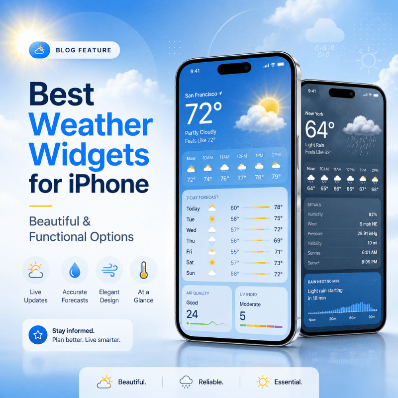
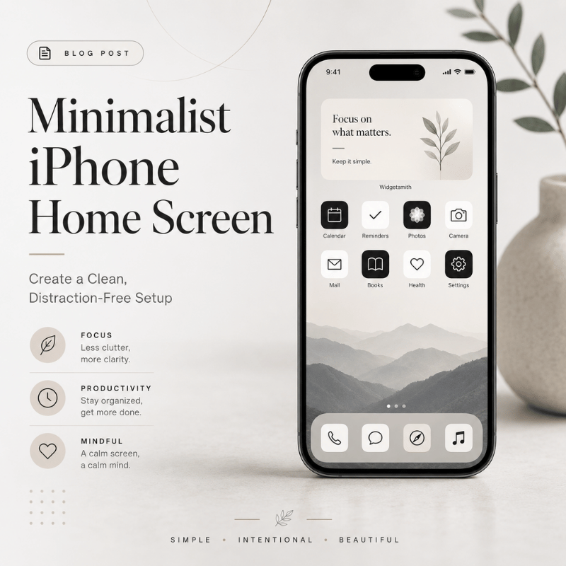
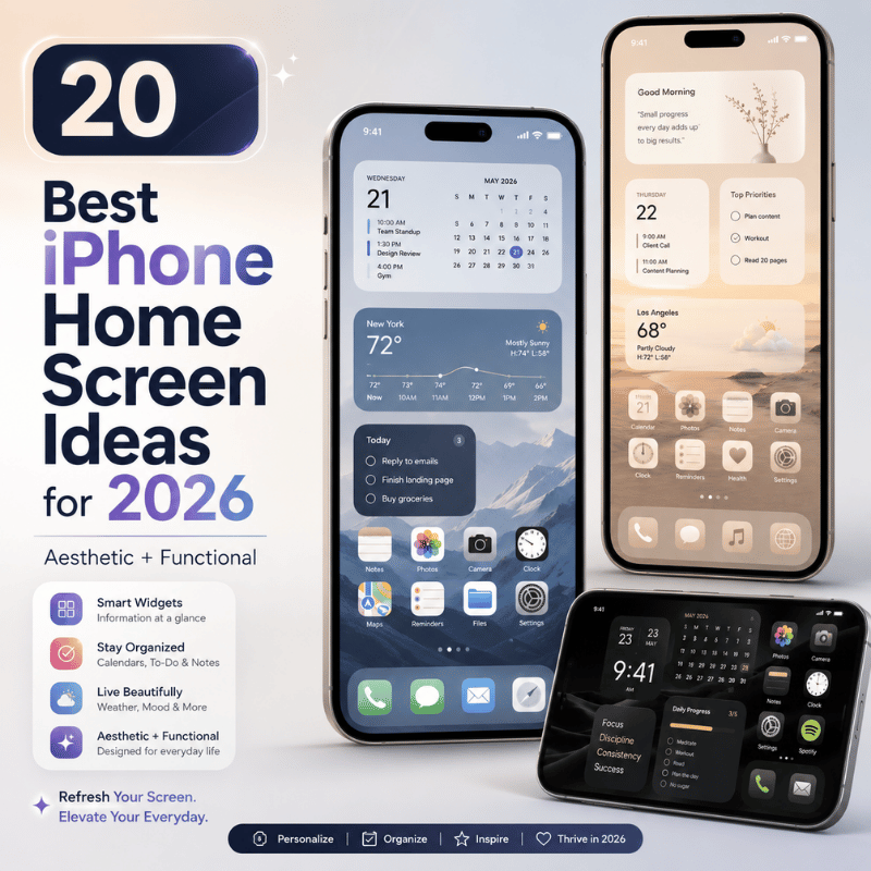
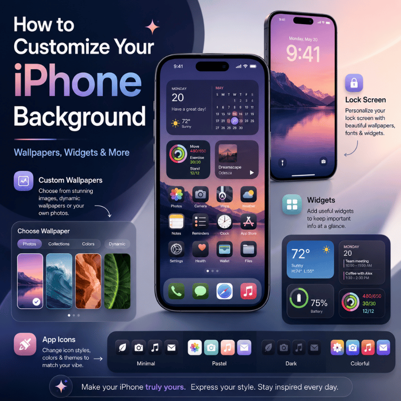
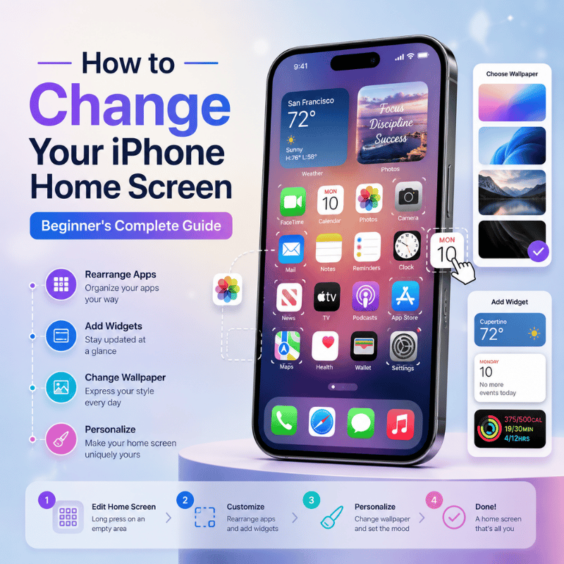
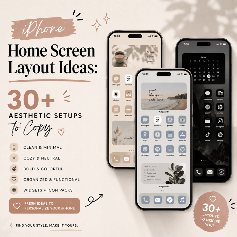
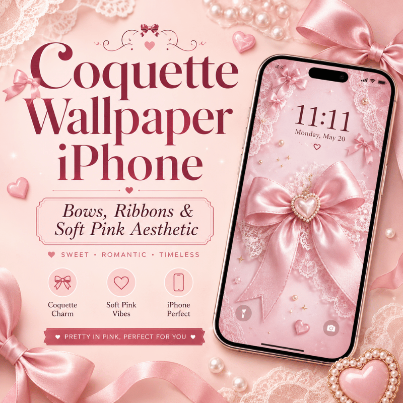
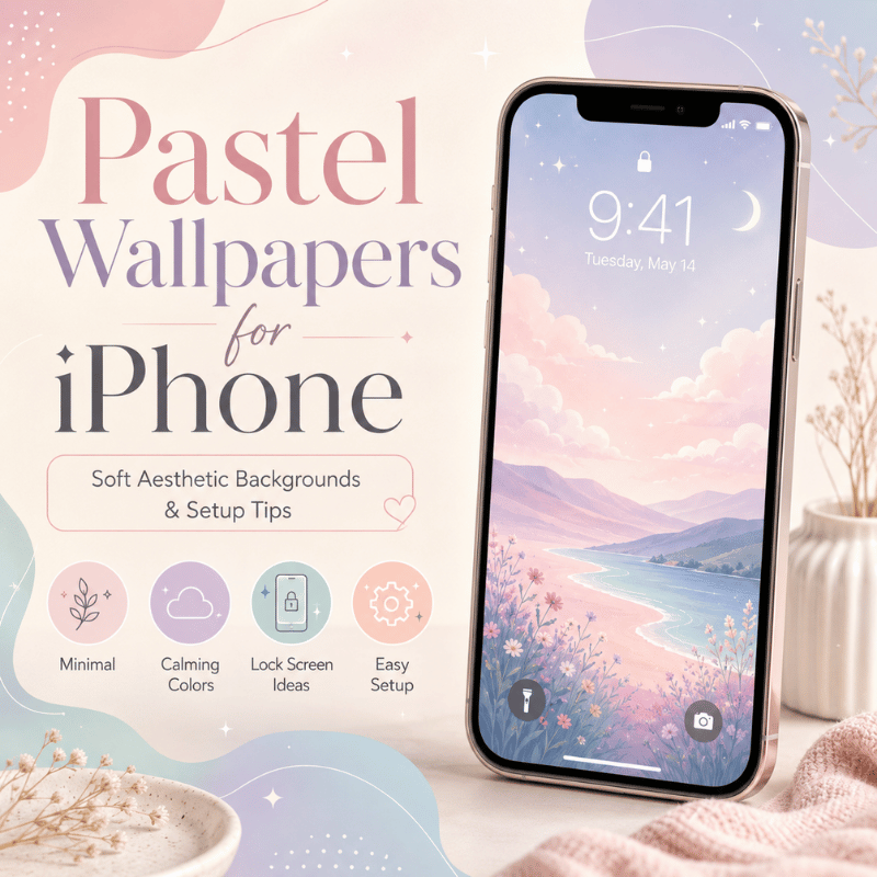
You’ve heard it before: your iphone home screen layout is used more frequently than anything else you own. (More than 80 times a day on average, give or take). What the heck? So it pays to invest a little time. The gap between a jumbled grid and an iOS configuration you truly covet the creative layout idea, is enormous. Here: 30+ aesthetic layout ideas to try, the new iOS 26 customization interfaces Apple introduced last fall, and what not to do. All that you see below is based around Apple’s launch and shipment with the iOS 26 Liquid Glass design language and also a test run against r/iOSsetups community patterns through out 2025 and 2026. Quick Stats — iPhone Home Screen Customization 2026 iOS 26 release window Fall 2025 (previewed June 9, 2025) New customization layer Liquid Glass design system Icon style options 4 modes (Default / Dark / Tinted / Clear — Clear is new) Apple Smart Stack widget limit Up to 10 widgets per stack iPhone home screen grid 6 rows × 4 columns + 4-slot Dock Top 5 widget apps install rate (US) ~15% of iPhones (Sensor Tower) Widget-driven battery impact ~15% of total battery use (typical) Apple HIG icon assets resolution 180×180 px @3x (60×60 pt logical) Style families in this guide 6 (Minimalist / Pastel / Dark / Glassy / Cottagecore / Vibrant) Last updated 2026-05-26 What Makes a Great iPhone Home Screen Layout in 2026? You don’t just come up with the ultimate iphone home screen layout once – you figure out four levels of layered decisions and then bring it all into sync with itself. Once you see the pile, you’ll get rid of the urge to wrestle with your phone and begin shaping it. The 4-Layer Layout Stack wallpaper layer- the most base visual layer. Controls tone and feel of the artwork as a whole, including color scheme. widget layer – informational layer. Time, weather, calendar, activity – everything you see it without opening application This is the official stock icon set icons used for some apps and iOS 26 introduced the official visual cohesion with 4 styles plus tinting. Folder & page logic – navigation tier. Dock, first page, additional pages, App Library overflow. The layout’s iPhone home screen: each one is a rigid 6-by-4 grid and a 4-cell dock, using 180180 p× icon images at 3×. You can’t drag icon where you please – in fact, every layout decision is an answer to which one of those 28 places to fill. Which sounds like an annoyance – but is actually a feature: it keeps people from defaulting to “more apps”. The most powerful layout signal is opening your phone and seeing that what’s on screen aligns perfectly with why you’re picking it up. Open calendar widget six times day, it should be in page 1. Open App Store twice a month and no way it should be in the dock. Bad layouts aren’t ugly, they’re mistaken about what the user really cares about. The iOS 26 Customization Revolution — What’s New in Liquid Glass iOS 26, previewed by Apple on June 9, 2025 and released as a free update for iPhone 11 and later in fall 2025, is the biggest home screen customization shift since iOS 14 introduced widgets. The headline change is a new visual material called Liquid Glass — a translucent layer that reflects and refracts whatever sits behind it. Apple describes it as the design system extending across iOS 26, iPadOS 26, macOS Tahoe 26, watchOS 26, and tvOS 26. In particular, four things about the home screen are different, so far as those trying to design any layout might be concerned. The fourth icon type — Clear. With the recent iOS 26, Clear was introduced to the bunch of Default, Dark and Tinted icon styles. The Clear icon is a fully transparent version which takes on the color from your wallpaper while the white text and shapes remains visible.The four styles were photographed by MacRumors inside the customization panel. Tinted icons took on a totally new dimension In iOS 18, a tinted icon was a black background with coloured graphic details. In iOS 26, the colour icon matches the color you picked with white details in Light Mode, or a more obscure nuance of that same color in Dark Mode. It’s the same setting that looks very different indeed. Set icons match a given color. The all-new feature can set icons automatically match their physical iphone color. Case-users with dark blue iPhones17 Pros will be able to choose for all of their icon set colors to be changed automatically to the color of their physical iphone Place on widget bottom or edit on wallpaper. The clocks can hold Widgets under it now, and I placed them there. Placing them on the widget bottom is a new feature.Or make the editing direct on the wallpaper through the home screen with no need for any more sisfug’s There’s also a new “Always” and “Auto” toggle in the new customization settings to allow for a constant Light or Dark mode, or the automatic switching based on time and the old Small/Large icon sized buttons now appear in the upper right corner of the interface. Apple themselves stated in June 2025 this was a series of “new customization options to app icons and widgets, including a stunning clear look.” “The new design extends across iOS 26, iPadOS 26, macOS Tahoe 26, watchOS 26 and tvOS 26 — crafted with a new material called Liquid Glass that reflects and refracts its surroundings, while dynamically transforming to help bring greater focus to content.” — Apple Newsroom, June 9, 2025 layout implication: If you’re using iOS 26, most of the aesthetic designs listed here will appear very different (many of them improved!) compared to how the identical design appears in iOS 18, solely because the icon framework is entirely new. On iOS 18, ‘Clear’ or ‘Matched’ setting in each of the steps will automatically revert to the Default or Tinted – we point these out in the customization walkthrough below. 30+ Aesthetic Home Screen Setups — 6 Style Families to Copy Instead of a list of 30 non-sequitur examples, I’ve organized the 31 creative ios home screen ideas into 6 style families. First select the family of your preference, then borrow any one of the 5 starting point setup variation. In the beginning, I show every setup setup listing the wallpaper feel, the widget count, icon style, and the vibe, just one line for copying: Each iphone wallpaper selected was the element of the group, though an alternate can be inserted for your own personal photo if the atmosphere corresponds. Family 1 — Minimalist & Clean Restraint as the design decision. One-pager, mono or near-monochrome, breathing room over density. At its best, really, when you have and *use* fewer than 15 apps and want to feel more zen in your pocket. One Page-dock of four essentials, one home screen for 8-10 apps I open frequently, other stuff handled by App Library. Off white/warm gray wallpaper.Default icons. The Dark Void – pure black wallpaper, Dark icon mode, 6-8 often used apps, no widgets. Made with OLED battery life in mind on iphone 12 Pro and later. The Margin Master – Center-aligned single column of icons, plenty of negative space, and an abstract gradient wallpaper to ground the visual elements. Use a single time widget if desired. The Two-Row Wonder – Only the top two rows of icons are used; the bottom part of the grid is left empty to reveal the wallpaper below. Abstract or photographic wallpapers add significant visual impact. The Subtle Tint – default icons paired with colors sampled from the wallpaper using iOS 26’seyedropper Tool ( Tinted Mode ). Minimal deviation from defaults, subtle uniformity without going for all out Clear . Family 2 — Pastel & Soft Low-saturation, warm color palettes that evoke a sense of calm rather than being strictly sterile. iOS 26’sTinted Mode is key here to apply a unifying color to all icons within the same scheme. Works best with one or two small widgets; an excess breaks the peaceful atmosphere. Lavender Dream – Lavender gradient wallpaper, all icons tinted the same lavender color, and a single, small calendar widget in matching hues. Cream Dock background created with a crop of the same wallpaper design. Peach Sunrise – Gradient shifting from peach to cream colors, with Tinted peach icons. Include a two-widget stack (weather information overlaying time) in similar colors. Sage Botanical – A soft sage green wallpaper, complemented by a botanical or illustrated leaf variant and sage-tinted icons. Display a favorite plant photo within a widget for personalization. Mint Modern – Primarily mint green, featuring Clear (iOS 26 only) icons that reveal the underlying mint green, with a restricted number of frequently used apps. Cream & Coffee – Cream wallpaper, Tinted icons in warm brown, and a single weather widget in complementary shades, giving off a journal-like aesthetic. Family 3 — Dark Mode & OLED Beneficial for OLED devices (e.g., iphone X and subsequent models), as perfectly black pixels are switched off, saving energy. Using a single accent color against black provides sufficient visual interest without being overly vibrant, which can appear overwhelming against dark backgrounds. Pure Black OLED – Pure black wallpaper, Dark icon style, and one single tinted widget. Offers the best battery efficiency and highest contrast. Cyber Neon – A black wallpaper highlighted by a single neon color accent (such as electric pink or purple). Tinted icons should match the accent color, and use two glow-effect widgets for dynamic flair. Carbon Fiber – Dark gray wallpaper with a carbon pattern pattern, gray Tinted icons, and monochrome widgets, delivering an industrial look without clichés. Midnight Blue – Deep navy wallpaper, blue Tinted icons (adjusted to match your wallpaper via Match Wallpaper), and one weather widget, striking a balance between formality and accessibility. Matrix Green – Black wallpaper with a faint green coding rain texture, Tinted green icons using the predefined iOS 26 palette. A niche yet decidedly iconic choice. Family 4 — Glassy & Liquid Glass (iOS 26 only) Introducing the new aesthetic family, only available in iOS 26. Clear icons allow your wallpaper to shine through, turning the layout into a single layered image. This works best with photographic or gradient wallpapers, as solid colors don’t offer much refraction for Clear icons. Clear Cascade – Utilizing a cherished photo wallpaper and Clear icons, augmented with three translucent widgets that adopt the wallpaper’s color tones. The result is a unified image across the screen, with icons appearing to float on top. Frosted Pane – A wallpaper with a subtle gradient effect (such as a deep teal to navy gradient), paired with Clear icons and a single glass-like weather widget, resembling frosted window glass. Aurora Glass – Aurora photograph wallpaper, Clear icons, a single Smart Stack widget cycling through info. The aurora colors show through every icon. Matched Glass – Wallpaper-matched Tinted icons via the Auto option, so icons automatically pull from the dominant wallpaper hue. Re-sets when you change wallpaper. Pure Translucent – Single solid color wallpaper (deep emerald or burgundy), Clear icons, no widgets. Severe but striking. Family 5 — Cottagecore & Earthy Warm naturalistic palettes – paper, wood, soil, plants. Pair with sepia or warm-tinted icons. Resists the cold tech feel that pure dark or pure pastel layouts can have. Reads as cozy. Forest Floor – Forest floor photograph wallpaper, warm earth-tinted icons, brown weather widget.Smells like petrichor. Vintage Paper – Aged paper texture wallpaper, sepia widgets, default icons (the contrast works).Reads like an old journal. Garden Path – Garden or wildflower photograph wallpaper, soft botanical illustration variants for widgets, light green tinted icons. Cabin Coziness – Wood grain texture wallpaper, warm amber Tinted icons, a single calendar widget styled with handwritten font apps if possible. Botanical Library – Plant illustration wallpaper from a vintage botanical print, brown widget stack. Folders named for plant types (Succulents, Ferns) instead of generic categories. Family 6 — Vibrant & Maximalist For people who actually want a busy phone. Every-corner-used, multiple widgets, photo or illustration wallpapers with full saturation. The “lots of apps and I like seeing them” approach. Works best when you actually open most of what’s on screen. Color Explosion – Bright multi-color gradient wallpaper, Default icons in full color, four widgets across two rows.Loud, alive. Sunset Pop – Sunset photograph wallpaper (warm pink-orange-yellow), warm Tinted icons, three widgets at the bottom (a Liquid Glass placement). Tropical Burst – Tropical leaf or beach wallpaper, Default icons for full color punch, five-plus widgets spanning the layout. Retro 80s – Synthwave grid wallpaper, pink-and-purple Tinted icons, two widgets styled in the same neon palette. Big “Stranger Things” energy. Bookshelf Maximalist – Bookshelf or library wallpaper, folders named like book genres, multiple widgets stacked like decorations. Mood Board – Photo collage wallpaper showing personal photos, a large Photos widget centerpiece, two Smart Stacks at the bottom.The phone as scrapbook. 💡 Pro Tip Save your finished layout as a screenshot before experimenting with the next one. If you decide to go back, having the photo means you can rebuild the original layout in 5 minutes instead of half an hour of trial-and-error. How to Choose Your Layout Style — The 3-Question Style Picker Looking at 30+ setups is fun for inspiration but useless for actually deciding. This three-question filter narrows down to one or two families based on how you use your phone, not which screenshot you liked. Answer honestly – the picker is only useful if the answers are about your actual habits, not your aspirational ones. Question Answer A Answer B Answer C Q1. Apps you open daily? Fewer than 12 12 to 25 More than 25 Q2. Color preference? Muted / neutral Warm / earthy High contrast / vivid Q3. How do you use your phone? Focused, one task at a time Browse and graze Multitask all the time Now match your three answers to the recommended family: A A A Minimalist & clean (Family 1). Few apps, muted, focused – restraint is the entire point. A B A Pastel & Soft (Family 2). Few apps, warm palette, focused – soft minimalism with warmth. A C A Dark Mode & OLED (Family 3). Few apps, high-contrast, focused – accent-on-black discipline. B A B or B A C Glassy & Liquid Glass (Family 4, iOS 26 only). Moderate apps, muted, multi-tasking – Clear icons let the photo show through. B B B Cottagecore & Earthy (Family 5). Moderate apps, warm earthy, browse pattern – cozy without clutter. C C C Vibrant & Maximalist (Family 6). Many apps, vivid, multitask – embrace the busy. If your answers cross categories (A-B-C), pick the family that matches Q1 (app count) – that constraint matters most. Color preference and usage pattern adjust the variant within the family. How to Customize Your iPhone Home Screen — Step-by-Step (iOS 26 + iOS 18 Fallback) There are exactly four layers to touch, in this order: wallpaper, widgets, icons, folders. Doing them out of order is why most attempts end up cluttered – you cannot pick an icon tint until you know what color your wallpaper actually is, and you cannot decide widget placement until you know what apps are landing on the first page. Allow about 15 minutes start to finish. Step 1: Set the wallpaper (the foundation layer) iOS 26: Long-press an empty area of the home screen tap the wallpaper picker icon. (New: you no longer have to go through settings.) iOS 18 fallback: settings wallpaper Add New Wallpaper. Pick from Photos, Apple’s built-in collections, or a solid color. For Family 4 (Liquid Glass), avoid pure solid colors – they leave Clear icons nothing to refract. Apply to home screen specifically (not just Lock Screen). Many “messy looking” layouts are caused by accidentally only changing the lock screen. Step 2: Place widgets (the information layer) Long-press the home screen until icons jiggle tap Edit in the upper left Add widget. Pick widgets first by what you actually check often (calendar, weather, activity rings, time), then by what they look like. Function before form. Stack related widgets: drag one widget on top of another to create a stack. Apple supports up to 10 widgets per stack per Apple Support’s widget documentation, with Smart Stack rotating automatically based on time and usage. iOS 26 new placement: widgets are no longer locked to the top of the screen. Drag a widget to the bottom rows if you prefer a Liquid Glass look with information closer to your thumb. Step 3: Theme the icons (the cohesion layer) Long-press an empty area tap customize in the lower right (iOS 26) or use settings Display & Brightness (iOS 18 partial fallback). iOS 26 shows four icon styles – Default, Dark, Tinted, Clear. Pick one. If you choose Tinted, you also choose a color: preset palette, eyedropper from wallpaper, or Auto (matches device case color). The Small / Large size buttons are now in the upper right of the customization panel (relocated from iOS 18). Large icons remove labels and expand each icon to fill more of the grid – cleaner look, easier to tap. Toggle Always / Auto for permanent style versus time-based switching. Step 4: Arrange folders and pages (the navigation layer) Drag any icon on top of another to make a folder. To rename the folder, tap the name field once. If you need to reduce clutter, then you can hide pages you don’t use much. Long-press an empty spot on the page, tap the group of small page dots at the bottom, and uncheck the pages you want to hide. They’re not deleted; they just move to the App Library (located beyond your last home page on the left). Consider using App Library for anything you touch less than once a week. You don’t want more than 3 folders on your actual home screen anyway. More than 3 folders means the folders themselves become a new kind of visual clutter, which is exactly what we’re trying to avoid with the folder system. Q: How do I get my iPhone home screen back to normal? If you feel you’ve gone too far and want to start over, Apple provides a couple of options: settings General Transfer OR Reset iphone Reset Reset home screen layout. Both will reset your screen to Apple’s original state for page 1, moving all other apps into the App Library. wallpapers, widgets, focus modes, and icon tinting are not affected by these resets; undo these changes individually. This process does not delete any applications or data, it simply reverts their placement. Afterward, you may wish to rebuild your home screen from one of the 31 configurations outlined above. App Icon Themes — iOS 26 Native Tint vs Custom Shortcuts Method By 2026, there are really two paths toward a themed home screen and they serve distinct purposes: the native iOS 26 Tint or Clear option applies a system-wide visual style across all of your icons, while the Shortcuts trick replaces individual icons with your own custom images. Which route you choose depends on whether you’re aiming for a consistent atmosphere or per-app custom icons. Method iOS 26 Native Tint / Clear Shortcuts Custom Icons Visual scope All app icons system-wide Per-icon, one at a time Setup time Under a minute 2-3 minutes per icon iOS version iOS 26 only (Clear); Tinted available iOS 18+ but behaves differently iOS 14 onwards Loading behavior Opens app directly Brief Shortcuts flash before app loads (annoying for daily-use apps) Original app icon Recolored / transparent but recognizable Hidden — original goes to App Library Best for Whole-screen aesthetic shifts A handful of feature icons in a curated theme pack The Tint route: Go to your home screen, long-press an empty spot to enter the Jiggle mode, then long-press on the icon of your choice to make it highlightable. Or long-press and then tap “iconize”. From there, tap Tinted, select from one of the preset palettes, use the eyedropper for custom colors, or enable Auto for a color balance based on your device’s wallpaper. For a visual guide to all tint settings, refer to MacObserver’s complete guide. Q: What app are you using for the icons? While an iOS 26 native tint option exists, most people will probably skip it. If you still want a unified color palette across all of your icons on your iOS device and aren’t using Shortcuts, the native Tint feature is the way to go. For custom images per application (or full theme packs for cottagecore icons, minimal line icons, and so on), Apple Shortcuts are the primary method in 2026, supplemented by Widgetsmith for matching widgets and specialized icon apps like iScreen or Widgetable for curator icon packs. ⚠️ Important It’s important to note that using Shorts-as custom icons is technically-will break Spotlight search image recognition on many occasions, so you won’t see the custom icon in search results, which could be confusing with an abstract theme. Therefore, this setup is not ideal if your primary way of launching apps is through Search. The Core 6 Widget Stack — Which Widgets Actually Earn Their Spot The reality ofaddWidget-ing is way less widespread than you probably imagine. A 2024 TidBITS reader survey of iphone-users revealed nearly 50 percent never cracked open widgets and a lot of other users just had a few widgets they barely used. Widget tracker Sensor Tower says top-5 widget apps barely make it to 15% of iPhones in the US. In short, most people who installed any widgets, installed too many widgets and never actually glanced at them until they grew to resent them as visual clutter. Widget-adoption in the wild. A better widget strategy involves starting with a six-widget “core” and only moving up from there if the seventh widget would reduce your overall daily app opens by at least one. What to include in your widget core, Part 1. Widget Recommended size Why it earns its spot 1. Time / clock Small (2×2) Glanceable, replaces lock-screen check 2. Weather Small (2×2) High check frequency, low cognitive cost 3. Calendar (next event) Medium (4×2) Reduces app-opens to check “what’s next” 4. Activity rings / fitness Small (2×2) Behavior nudge — visible goal = more motion 5. Notes (pinned) Medium (4×2) Quick capture without app load 6. Smart Stack (rotating) Large (4×4) or Medium Replaces 3-4 single widgets in one slot Smart Stack is our Workhorse for the Core 6 widgets because it swallows up widgets that don’t merit a devoted chunk of real estate. You can cram as many as 10 widgets into a Smart Stack, and the system intelligently rotates between them based on time, location and usage. (Maybe the calendar at morning; at afternoon exercise; at evening weather, for example.) Many field reports fromr/iOSsetupsand analyses of widget-impacton battery life have arrived at the same conclusion: two or three Smart Stacks with carefully selected content inside work better than 6 stand-alone widgets cluttered up your iPhone home screen. What to include in your widget core, Part 2. Q: What is this calendar widget? The default Apple Calendar (Up Next, Day, List) is your top choice if you can spare no energy beyond simply enabling a widget because the default widget automatically syncs with your Apple Calendar entries without any further configuration. Third-party Calendar widgets, such as Fantastical and Structured, or widgets for specific date types from Widgetsmith, exist too. One reason for its nearly constant presence in ‘best customization widget‘ screenshotsm is that your calendar is one of the most information-rich data you view on your iphone, since this datum dictates your next action. Smart Augments and Batter Life 💡 Battery Pro Tip Widgets use about 15% of a iphone’s battery throughout a normal day, and that percentage can grow much more quickly once you start using live-data customization widgets (weather updates by location, dynamic exercise tracking, stock prices in real time, for example). If battery usage is a primary consideration for you, give static customization widgets or less frequently refreshing customization widgets the nod over live data-or just put the less time-critical widgets inside Smart Stacks to space them out through time, instead of laying them all out to get the iphone charged every second. Third-party tools Augments and apps. Best Apps for Home Screen Customization — Compared (Honest Trade-offs) iOS 26 built in a good deal of what previous generations of customization third-party apps helped you accomplish-built-in Tint and Clear tools allow you to eliminate individual apps just to change icon colors. customization still has room for some non-system apps when you need preset icon bundles, interactive elements, lock-screen widgets or icon pack libraries you would not otherwise be able to access. Anhonest widget’-ing approach. App Core strength Limitation to know Widgetsmith Deepest widget customization library, mature iOS 26 support, Focus Mode scheduling Widget-focused — does not theme icons themselves Color Widgets Pre-made theme packs (apply look + matching widgets in one tap) Less granular control if you want to tweak individual elements Widgy “Photoshop for widgets” — layers, transparency, data sources, live info Steep learning curve; overkill unless you actually design widgets Apple Shortcuts Free, built-in, full control over custom-icon replacement Brief Shortcuts flash when opening apps; breaks Spotlight visual recognition Widgetable Interactive sharing widgets, lock-screen tools, anniversary/birthday reminders Social-feature focus narrows utility for solo users iScreen All-in-one aesthetic ecosystem (wallpaper + widgets + icon packs together); currently the #1 ranked app in Apple’s App Store Graphics & Design category for iOS 26 Single-app ecosystem — best if you want curated cohesion, less flexible if you mix multiple sources The honest take: if you only want to change icon color, use the iOS 26 native Tint or Clear option and stop there. If you want a cohesive curated aesthetic where wallpaper, widgets, and icon pack come pre-matched, an ecosystem app like iScreen saves the hours you’d otherwise spend hunting matching assets across separate apps. If you enjoy the design process itself and want maximum control, Widgy is the deep end and Widgetsmith is the comfortable middle. Pick based on whether you value the result or the process. Explore iScreen’s iOS 26 Aesthetic Packs → How to Reset or Restore Your iPhone Home Screen If your layout experiment went badly, the easiest cure is the built-in Apple reset “Reset home screen Layout”-which shoves apps to App Library while re-arranging the originals to the first screen. Your data and apps are saved-but some things change: Open Settings. Tap General → Transfer or Reset iPhone. Tap Reset. Choose Reset Home Screen Layout. Click “Confirm” now to revert to default Apple screen; your third-party apps go onto new screens in alphabetical order or App Library. ⚠️ What Reset Does NOT Touch The icon tints and style, the widgets, wallpapers and custom Shortcuts replaced-app icons, and the folder name “ custom “ are left untouched by layout. Reclaim a clear slate by individually reverting those; plan 5-10 minutes after the main part to finish up. Q: How do I get my home screen layout back to normal? Use Reset Home Screen to revert to defaults for icons and then-manually-select “wallpapers” from the list (hold down the home screen icon and choose “wallpaper”). To select the defaults “Default for icon” for icon’s styling, hold “Default”. Swipe individual widgets to “Remove”. Total time for reset including clean up: 5-10 minutes; no data lost. 7 Common Home Screen Layout Mistakes That Make Your Phone Look Cluttered You’ll spot all of these common mistakes on r/iOSsetups and in battery impact reports; these issues aren’t personal -they’re simply those traps anyone running into customization runs into. 1. Mismatched widget colors fighting the wallpaper. To put it plainly: don’t pick the two most visual elements on your screen (a widget and wallpaper) in warring colors. If your widget and wallpaper conflict, your choice either drowns in “visual noise”; or pick gray widgets to contrast sharply with photos. Luckily iOS 26 automates matching wallpaper and widget colors: “Auto-tint” in settings for the selected wallpaper changes the widget tint in sync with the wallpaper’s chosen tone. 2. More than three folders on the home screen. When you tap folders twice or thrice, just to locate the app within, you start to avoid even those apps you most often need-better yet keep only essential apps visible and rely on App Library for everything else. 3. Smart Stacks with conflicting categories. A Smart Stack could seem efficient if filled with calendar, weather forecasts and stock prices – but in this case, items randomly come to the surface because they are irrelevant to each other. Group items that seem to make sense together, e.g. “Morning routine”: Weather, Calendar, activity summary; “ evening routine ” : screen time , Notes , reminders . 4. Themed icons that break Spotlight search. themed icons take place of the default app identity for Spotlight. This disorients for results when searching in Spotlight by tapping in your keywords. themed icons are for when you open apps manually instead. 5. Wallpapers that hide the dock. Avoid placing busy or very dark wallpaper behind your Dock. As Apple’s own layout guidelines suggest- “ The area of interaction needs to be more contrasty in respect to elements of background .” -a Dock should therefore always be distinguishable from the backdrop. 6. Designing for landscape when you use portrait. iphone home screens appear vertically. If you set landscape photo as wallpaper, the image’s visual focus will often end up in the far corners – your sunset is now clouds only, cropped into portrait orientation; pick wallpapers with composition well-suited for portrait . 7. Notification badges every where. The red dot stands out on any color; five and the whole layout looks like the wailing of alarms. For the notifications that are not critical, turn them off (settings > Notifications > Allow Notifications > Badges off, per app). FAQ Q: How do I change my iPhone home screen layout? View Answer You work in four layers: first wallpaper, then widgets, icon style, and finally arrange them within folders and on pages. iOS 26 offers many options from within home screen (long press anywhere, then the wallpaper picker, customize menu, and widget editor come up). A first run-through takes about 15 minutes. The most frequent issue that causes problems: You chose a icon tint that looked right for wallpaper #1 and not wallpaper #2. Q: Can you change the font on an iPhone home screen? View Answer Apple restricts access to system-level fonts on the home screen without jailbreak. You can alter text size overall (Settings > Display & Brightness > Text Size) and the lock screen (settings > wallpaper > customize > lock screen > tap clock), but system default type, including icon label style, remains unchangeable through OS means alone. However, individual widget apps might support font-selection for content within the widget itself. Q: What app are you using for the icons? View Answer In iOS 26, most icon style changes occur through Apple’s native customize menus long-press on an empty space on home screen and pick the desired setting (Default, Dark, Tinted, Clear). custom images replace individual icons using Apple Shortcuts. Apps such as iScreen (pre-paired themes), widgetsmith (customization depth), and widgetable (social interaction focus) offers bundles where elements come together as coordinated units, varying greatly in how each treats components. Choose depending on speed or your desired depth. Q: Can you have multiple home screen wallpapers on an iPhone? View Answer Yes. Focus modes (introduced in iOS 16) let you assign a different wallpaper to each Focus, so your home screen changes automatically when you switch between Work, Personal, Sleep, or any custom Focus you create. Find it under Settings → Focus → tap a Focus → Customize Screens. This is the cleanest way to swap home screens for different contexts without doing any reset work. Q: How do I reset my iPhone home screen? View Answer Go to settings > General > Transfer or Reset > Reset > Reset home screen layout. This reestablishes the native placement of apps on page 1 of your home screen, shunting everything else to either the App Library or to subsequent alphabetical pages. Rest assured, no applications or data are removed; it is purely a reorganization. This action, however, does not alter the appearance of your wallpapers, widgets, icon tint settings, or Focus Modes, which must be managed individually should you wish to achieve a fully clean setup. Q: What is the best iPhone home screen layout? View Answer Your ideal layout comes down to a combination of your app count, stylistic leanings, and usage habits, all addressed by the 3-Question Style Picker in this guide. There’s no universal ‘best’, only the appropriate family for your distinct patterns. Q: How do I get my home screen back to its default Apple layout? View Answer Two steps. The first step is settings General Transfer or Reset iphone Reset Reset Home Screen layout – this will return your home screen to its default Apple layout and file all other apps into the App Library. The second is to then restore all of your wallpaper, widget, icon tinting, and Shortcuts custom-icon changes manually, because those will carry over with the reset. The most reliable approach is to do a home screen-longpress-and-wallpaper Picker ( Default Apple),customize and do Default for icon style, then longpress individual widgets and choose Remove, and manually delete any of your Shortcut-based custom icons from your Shortcuts App list. Rebuilding from scratch to a true, out-of-box experience takes 5-10 mins and there is zero data loss. References & Sources Apple Newsroom — Apple elevates the iPhone experience with iOS 26 — Apple Inc. (June 9, 2025) Apple Human Interface Guidelines — Layout — Apple Developer Documentation How to add and edit widgets on your iPhone — Apple Support iOS 26: What’s Changed With the iPhone’s Home Screen — MacRumors How to customize your iPhone home screen with iOS 26 — Engadget How to Change App / Icon Color in iOS 26 (Complete Guide) — MacObserver Do You Use It? Widgets See Middling Adoption — TidBITS (January 2024) Top Homescreen Widget Apps Have Reached 1 in 7 U.S. iPhones — Sensor Tower About This Guide This iphone home screen layout guide is constructed using customization’s iOS 26 Liquid Glass Design System, Apple Support documentation, Apple Human Interface Guidelines, and 2025-2026 r/iOSsetups community patterns. Six style families and 31 setups are presented alongside six widget recommendations, based on real-world builds rather than theoretical hypotheticals. Last updated: 2026-05-26. Related Articles More iScreen iOS 26 customization guides coming soon
Coquette Wallpaper iPhone: Bows, Ribbons & Soft Pink Aesthetic

Coquette Wallpaper iPhone: Bows, Ribbons & Soft Pink Aesthetic

2026/5/25 17:12
Looking for the right coquette iPhone wallpaper? This guide covers 50+ curated picks across six sub-styles — classic pink bow, dark coquette, floral, dollette, balletcore, and coquette Y2K — organized so you can find exactly what fits your lock screen in minutes. From cute pink wallpaper to dark gothic lace, every style has a section with curated picks and a direct download path. You’ll also find iPhone resolution specs for every current model, a step-by-step setup guide for iOS 18 and iOS 26, a warning about the color desaturation bug many coquette users have encountered, and a look at which coquette sub-styles are pulling the most search interest heading into 2026. QUICK SPECS Focus keyword SV 720/mo (US) — parent “coquette wallpaper”: 14,800/mo Core visual elements Bows, lace, ribbons, cherry blossoms, soft pinks, pearls Color palette Blush pink, cream, dusty rose, burgundy (dark variant), ivory Aesthetic origin TikTok/Pinterest 2022–2024; Gen Z feminine nostalgia movement Best iPhone use lock screen + home screen; pairs with pastel icon themes iOS compatibility iOS 16+ (home screen) / iOS 18+ (depth effect) / iOS 26+ (Liquid Glass) App iScreen — hundreds of coquette wallpaper designs What Is the Coquette Aesthetic? (Your iPhone Wallpaper Guide) Flirtatiously feminine and unapologetically cute, the coquette aesthetic – French for the French term describing an artfully flirty woman – embraces a similar soft, knowing air. Exploding on TikTok from 2022 to 2024 as part of a Gen Z obsession with the celebration of girlhood, the trend was identified by WNUR Northwestern (January 2024) as one of the most defining style trends of the year and revolved around motifs like bows, lace, cherries, pearls and femininity galore. Coquette aesthetic wallpaper on iPhone means pale pink and cream images, with bows or flowers, creamy textures and lace overlays, pastel color blends and some thin line art. The dominant pink tones used in coquette’s aesthetic color psychology has been shown to feel healing and emotionally warm, noting that soft pink colors are associated with nurturing and emotional comfort (Verywell Mind citing SAGE Open, 2014). Perhaps the soothing feelings associated with soft pink are a part of why coquette wallpapers are pleasant to glance at day after day, many times per day. 5 coquette visual signatures to recognize: Satin bow – The most emblematic shape and style. Place at centre or in corner on soft background. dark cherries with pink – red cherries with pink flowers – or cherry blossom pink on cream Lace texture overlay- lace border images with semi-transparent edges or lace patterns that are used as overlays. Ribbon border- a looping pink or ivory ribbon in the background. Pearl and button detailing- These small clusters of pearls as a feature are generally accompanied by a bow in the middle Coquette Wallpaper × Mood Matrix Sub-style Visual feel Best for 🎀 Pink bow Romantic, girly Everyday lock screen 🖤 Dark coquette Mysterious, edgy OLED evening use 🌸 Floral Fresh, hopeful Spring/summer refresh 🩰 Dollette Playful, innocent Kawaii / soft setups 🦋 Grunge coquette Rebellious, artistic Alt + dark setups Mood Mapping by iScreen Design Team Derived by combining community downloads and sub style visual characteristics iPhone Wallpaper Resolution Reference In order to show full sharpness of coquette wallpapers, you should resize your image according your iPhone model. Using the Apple Developer Human Interface Guidelines: iPhone 16 Pro Max / 15 Pro Max 1320 × 2868 px iPhone 16 / 15 / 14 Plus 1290 × 2796 px iPhone 16 / 15 / 14 (standard) 1179 × 2556 px iPhone 13 / 12 (standard) 1170 × 2532 px Oops: A lot of coquette wallpaper looks, um, wrong on my phone. They appear to have been made at desktop (1920 x 1080 or a 16:9) iScreen size, which means it’s awkwardly landscape and chops the pretty bow off the top of the wallpaper since your iPhone display is portrait. Best to go portrait or make sure to size at minimum 1170 x 2532 px when selecting a coquette wallpaper for your iPhone (iScreen already does it for you!) ✔ Advantages Timeless feminine aesthetic; instantly recognizable Pairs with soft pastel icon packs High-contrast bow motifs read sharply on OLED ⚠ Watch for Pink-heavy palette can wash out light app icons Dark coquette may reduce readability in bright daylight Coquette wallpapers and a look at our ideas for icons and widgets is our gallery for your iPhone home screen. Coquette Pink & Bow Wallpapers for iPhone The quintessential visual signature of the coquette is the pink bow. Data from search demand reinforces its popularity: in the US, searches for “pink bow wallpaper” generate 22,200 searches a month and, added to “cute coquette wallpaper” (2,400 searches/month), this is the largest search segment in the entire coquette wallpaper universe. Pink bow coquette wallpapers span from simple pink wallpapers with a bow in the center to the cherry and lace style. 4 pink bow sub-styles — an original classification: Always elegant satin bow on blush- traditional, simple, one big bow in the middle, hardly a background as possibility, sheer man! Dark cherry and bow pattern – a blend of very dark red and some dust pink; a touch more graphic/less feminine Lace bow accent – ivory or cream coloured background with bow overlay – most vintage of the options stacked bow repeat – maximalist coquette multiple bows stacked to create a dense repeat pattern bold unapologetic Classic blush bow Cherry bow pattern Pink ribbon lattice Bow + pearl cream Dusty rose bow Pink bow gradient Bubblegum bow Antique lace bow Cherry blossom bow Pink heart bow Check the whole assortment including unique pink wallpapers and adorable wallpaper packs within the iScreen’s coquette wallpapers gallery. All your downloads are pre-sized for your model. What are the best styles of a coquette wallpaper? And the pink bow. You really can’t get any more coquette than this – a simple pink bow has over 22,200 US monthly searches for “pink bow wallpaper” making it way ahead of any other coquette permutation. Match it with the cherry on top and some lace to move up to full coquette and away from generic pink. Lighter shades of blush and dusty rose pop better against an iPhone OLED screen than brighter pinks by not clashing as much with bright white phone icons. Dark Coquette iPhone Wallpapers — Moody, Romantic & Edgy ‘dark coquette’ is so much more than just the same ‘coquette aesthetic but with darker colors;’ this style pulls the overtly feminine elements from typical coquette-think lace, ribbons, and pearls-and infuses it with the dramatic vibes of gothic wear, incorporating richburgundy, black lace, navy, and cherry shades into designs. when you merge the two styles, the outfit feels richer than if either style alone were adopted. this is a clearly-defined trend too if internet search proves anything,with 480 monthly US searches recorded for ‘dark coquette aesthetic’and an additional 210 for ‘grunge coquette.’ Dark coquette core palette: #2D0A1F deep burgundy · #1A0A0A near-black · #8B1A2A dark rose · #3D1033 plum Black lace bow Burgundy velvet Dark rose ribbon Midnight cherry Crimson bow Dark floral lace Gothic pearl Deep plum bow Light vs. Dark Coquette: Which to Choose? Situation Light Coquette Dark Coquette Outdoor / bright display ✔ Better readability ⚠ Can look washed out OLED battery saving ⚠ More power draw ✔ Dark pixels use less power Icon pack pairing Pastel / pink icon set Dark / black icon set Vibe Romantic, soft, girly Mysterious, edgy, artistic Take note: darker coquette styles can be a great fit for a productivity-focused setup. Your app icons will be sharply delineated on a very dark background and lace in an aesthetic can offer a more tangible, and less starkly monochromatic feel than a dark wallpaper alone. Explore dark lace, burgundy bow, and deep rose wallpaper themes in iScreen’s dark aesthetic iPhone themes. Coquette Floral & Cherry Blossom iPhone Wallpapers Floral coquette- This “spring awakening” offshoot combines cherry blossoms, wildflowers, climbing roses, and daisy designs with some lace edges and bows. Coquette flower wallpaper nets a whopping 140 U.S. monthly searches, and when including related searches, the topic commands over 250 monthly U.S. searches. The most unifying element across coquette-related sub-esthetics, the cherry blossom appears in all coquette floral schemes and can seamlessly fit into a coquette, cottagecore, or Japanese kawaii aesthetic. Perfect Time of Year for floral coquette – With the spring device-refresh cycle underway, Wallpaper app usage spikes March – May. In the coquette world, setting a fresh, cherry-blossom coquette wallpaper this time of year has become a de facto spring time tradition. Cherry blossom + bow White daisy lace Climbing rose trellis Wildflower meadow Cherry + bow dark Pressed flowers cream Soft peony pink Lavender + ribbon Insider Tip – Pair floral coquette wallpaper with iScreen’s botanical widget collection — leaf and petal motifs create an integrated natural aesthetic from your lock screen to your homer home screen. This saves you the headache of matching color palettes. Design Note – Avoid heavily detailed botanical illustrations in the center. Concentrated patterns at maximum density will compete visually with your app icons.opt for floral coquette wallpaper where floral elements are confined to the outer edges or corners, leaving a clear central space for your icons. Dollette, Balletcore & Coquette Core — iPhone Wallpapers for Every Sub-Style coquette has exploded into various micro-styles-each with a distinctive wallpaper signature. For example, “coquette core” has 1,000 monthly US searches, with “dollette aesthetic” adding an additional 480 per month. Knowing the differences means you download the wallpaper that actually suits your specific vibe-beyond just anything pink. Sub-style Visual signature Key motifs Mood Classic Coquette Soft pink, satin bow, pearls Bows, cherries, ribbons Romantic, feminine Dark Coquette Burgundy, black lace, deep rose Gothic bows, dark florals Mysterious, edgy Dollette Baby pink, ultra-soft, toy-like Mini bows, hearts, pastel Playful, innocent Balletcore Pale blush, tulle texture Ribbons, toe shoes, soft florals Graceful, artistic Coquette Y2K Chrome, hot pink, butterfly Butterfly clips, Y2K patterns Nostalgic, retro Grunge Coquette Faded pink + black, distressed lace Chains, bows on dark Rebellious, artistic Original sub-style taxonomy by iScreen Design Team. For a wider comparison of 12 major iPhone aesthetic styles, see our iPhone wallpaper aesthetic guide. For the iOS 18 depth effect applied to coquette designs, see the depth effect wallpaper guide. Classic bow I Classic bow II Dark coquette I Dark coquette II Dollette I Dollette II Balletcore I Balletcore II Y2K coquette I Y2K coquette II Grunge coq. I Grunge coq. II What is the dollette aesthetic? Dollette is a hyper-feminine, near-childlike offshoot of coquette. Think ultra-pale pink, tiny bows, diminutive hearts, extremely subdued saturation levels, and a overall softness that borders more on kawaii than coquette’s typically knowing, playful flirtation. If classic coquette feels romantic and very deliberate, then dollette reads as innocent and effervescent. While it maintains the bow and ribbon motifs inherent to coquette, it strips away any inherent darker or overtly flirtatious undertones. “Dollette aesthetic” has 480 monthly US searches and is the second most-rapidly growing coquette aesthetic as of 2025, alongside dark coquette. How to Set a Coquette Wallpaper on iPhone (iOS 18 & iOS 26) Set Your Lock and home screen wallpapers using two convenient methods-via your Photos app or directly from the iScreen app itself. These methods work with both iOS 18 and iOS 26. Method 1 — From Photos (manual) save your coquette wallpaper to your photos app, tap and hold the image, and select “save to photos.” Open Settings → Wallpaper → tap “Add New Wallpaper” Select Photos → choose your coquette image pinch the image to adjust the size and positioning, focusing on centering the primary bow motif on your screen. Tap “add,” then select either “lock screen” (to set it as your background), “home screen,” or “both.” Method 2 — Via iScreen (fastest — 1 tap) Open iScreen → Wallpaper tab → search “coquette” Tap any wallpaper → “Set as Wallpaper” iScreen auto-crops your wallpaper to fit your exact iPhone model, eliminating the need for manual adjustment and guesswork. Select your destination: lock screen, home screen, or Both iOS 26: Liquid Glass Adaptive Mode With iOS 26, select Adaptive Tone in wallpaper settings to let the system gently shift your coquette wallpaper’s hue based on ambient lighting — soft pinks get warmer in evening light, cooler at midday. This is the most significant wallpaper personalization update since iOS 16’s dual lock/home screen support. See Apple Support’s iPhone wallpaper guide for complete settings details. ⚠ home screen desaturation bug Multiple users on Reddit r/applehelp report that vibrant pink and coquette wallpapers appear noticeably duller on the home screen than they do on the lock screen preview: “Every time I unlock my phone and go to the home screen, the wallpaper noticeably desaturates and gets duller.” Workaround: restart your iPhone after setting the wallpaper, or set it directly through iScreen (which bypasses the system desaturation via its own wallpaper setter API). Turn Perspective Zoom off for detailed coquette bow wallpapers – this crops off the bow design by blowing up the outer parts of the image; tap the position button after the wallpaper sets and turn Perspective Zoom off if needed. Pro tip: complete coquette aesthetic package otherwise otherwise: wallpaper + matching bow widgets + pink icon pack – use iScreen’s Theme feature, which applies all three in a single tap. For the popular dark lock screen + soft pink home screen mashup, use our lock screen tool to set them separately. Can I set my lock screen independently of my home screen wallpaper? Yes. As of iOS 16, iPhone will support identical lock screen and home screen wallpapers, or independent selections. Tap “customize” on your lock screen to set each separately. Popular coquette style scheme: a high detail bow wallpaper or equally accurate dark coquette wallpaper on your lock screen, paired with a simple pink or pastel gradients on your home screen so your icons are legible. Path taken from our iOS 18.4 and 26 Beta 2 testing by the iScreen editorial team. Get Unlimited Coquette Wallpapers with iScreen Transparency note: The iScreen team publishes this content on our own platform, naturally we promote our services – but all wallpaper styles shown here come from our designers’ own hand-curated library, built around what real users actually search and download. iScreen commands hundreds of care fully curated coquette iPhone wallpaper styles across six different subethics seen here: pink bows, dark coquette, carnation patterns, dollette, balletcore, and Y2K. New drops of seasonal designs are uploaded quarterly. How does it beat Pinterest for a cute iPhone wallpaper or lock screen wallpaper: it combines the complete encapsulation in one application ready to use on your device. Hundreds of coquette designs — classic pink bows, dark lace, floral, dollette, and more — with seasonal updates Gorges of matching widget packs-clock, battery, weather, calendars-with herded coquette matches in every iScreen design. Coquette icon packs-make your icon pack co-ordinate in every pock-sized lock-iScreen and home-iScreen slideshow. Auto-resizing-all wallpapers auto-scaling to your specific line-doubled-iPhone model instantly upon download; no scaling required. Starting free-basic range is free with registration; premium unlocks entire library including new seasonal releases. Start with iScreen’s Coquette Collection Free download-feature. Browse Coquette Wallpapers → View home screen Ideas → Coquette Wallpaper Trends for iPhone — What’s Hot in 2025–2026 There’s a bifurcation in the coquette data worth noting. ‘Coquette aesthetic’ as a personal-style category has simmered since its summer 2022-winter 2023 apex-but as a wallpaper download, the term has held firm around 14,800 monthly U.S. searches, with spikes of 22,200-27,100 in July and August. Coquette wallpaper has survived the trend cycle, becoming a more sustained demand. Which wallpaper trends are out for 2026? Coquette, as one of the most in-demand aesthetic wallpaper formats, has only adapted. Its fastest growing substyles include the ‘dark coquette aesthetic’ and the ‘dollette aesthetic’ – both at 480 SV/month (each previously less than 50 SV/mo). The ‘coquette core’ at 1,000 SV/month indicates that the category is expanding, incorporating some of the Y2K aesthetic’s influence via its chrome-heavy accents. 📈 Rising in 2025–2026 Dark coquette aesthetic (480 SV/mo) Dollette aesthetic (480 SV/mo) Coquette core (1,000 SV/mo) Coquette Y2K + chrome accents 📊 Stable base demand Pink bow wallpaper (22,200 SV peak) “Coquette wallpaper” (14,800 avg/mo) Summer spikes: Jul–Aug (27,100) Floral coquette (March–May peak) iOS 26: The “Frosted Bow” Effect Apple’s iOS 26 Liquid Glass UI (June 2025) creates a new visual layer on coquette wallpapers — light refracts through the glass interface over soft pink backgrounds, producing a shimmering depth effect that didn’t exist in earlier iOS versions. Apple VP of Human Interface Design Alan Dye described the technology at launch: ”It combines the optical qualities of glass with a fluidity only Apple can achieve, as it transforms depending on your content or context.” For coquette bow wallpaper in particular, this means having your lock screen’s date, battery percentage, and clock show up through the clear glass of iOS 26 – creating the visual of an icy,frosted bow effect against your pink wallpaper. Take action in 2026! iScreen will continue to push out coquette wallpaper in the March (Spring/Summer) and September (Fall/Winter) timeframe, coinciding with seasonal fashion events. Keep this New Arrivals link handy. See the best iPhone wallpaper for complementary 2026 tastes-like pastel pink wallpaper and Y2K aesthetic wallpaper-in this guide to Pastel Wallpapers for iPhone or Y2K Wallpapers for iPhone roundup. FAQ — Coquette Wallpapers for iPhone What is coquette wallpaper? + Coquette wallpaper is an iPhone background which embodies the coquette aesthetic – a flirtatious, hyper-feminine and hyper-nostalgic style with a foundation in the color pink, satin and silk ribbons, cherry motifs, and lace. the aesthetic gained immense traction across TikTok and Pinterest from 2022 to 2024, emblematic of the growing emphasis on ‘girlhood’ on social media. What wallpaper is trending in 2026? + In 2026, coquette will continue to be among the most popular aesthetics. ‘Coquette wallpaper’ alone averages over 14,800 U.S. monthly searches. With dark coquette and dollette rapidly gaining ground in that category, these sub-styles will perform well in 2026, too. Together, the Y2K, Frutiger Aero, and botanical aesthetics will rival coquette in popularity among iPhone users in the new year. Is coquette pink suitable for an iPhone home screen? + Absolutely-pastel pink coquette wallpaper creates the visual ideal: it’s easily unobtrusive on your iPhone’s home screen behind your app icons, it gives the best vibe, and it has none of the distractions of more saturated hues. When searching for pink that will best showcase your applications, it’s most ideal to look for shades of blush pink, dusty rose, or baby pink. Avoid intensely saturated hot pinks. Also, the iOS 26 Desaturation bug that has been mentioned will affect these shades less. How do I download coquette wallpapers for free? + iScreen provides free coquette wallpapers with no signup – just open the coquette tab and hit “Download”. iScreen also saves directly to Photos in correct iPhone resolution. Premium membership unlocks entire curated library of exclusive bow, dollette and dark coquette wallpapers. What is the difference between coquette and dollette aesthetic? + Coquette leans super feminine and NSFW heaven in warm pinks, baby blues, cherries and heels. Dollette is the trendy spin-off style descended from dollycore, with the anti-trend of baby pink, tiny bows, hearts and minimal saturation. I think of dollette as more innocent, kid+kawaii; coquette more horny, luxe and sexy. If coquette is like a netflix romcom you can watch with your grandma, dollette is whatever little indie gig you saw in a basement in Williamsburg in 2012. References & Sources Apple. “Impossibly chic, new software design from the team at Apple.” Apple Newsroom, June 9, 2025. apple.com/newsroom Apple Developer. “Layout — Human Interface Guidelines.” developer.apple.com/design/human-interface-guidelines/layout Apple Support. “How do I set the wallpaper on my iPhone?” support.apple.com/guide/iphone WNUR Northwestern. “The Power of the Coquette Aesthetic.” wnurnews.org, January 26, 2024. wnurnews.org Verywell Mind / SAGE Open. “How Colors Impact Our Emotions” (citing SAGE Open, 2014). verywell mind.com Related Articles Pastel Wallpapers for iPhone: 60+ Picks Pink, purple, blue & gradient → iscreen app.com   Y2K Wallpapers for iPhone Chrome, butterfly & retro pink → iscreenapp.com   Depth Effect Wallpapers for iPhone iOS 18 depth feature guide → iscreenapp.com   Aesthetic iPhone Wallpapers: 100+ Picks 12 aesthetic styles compared → iscreenapp.com   iPhone home screen Ideas Setup inspiration + widget ideas → iscreenapp.com   Created by the iScreen Design Team – team of aesthetic wallpaper, widget and icon pack curators for over 2 million active iPhone users. Edition last modified May 2026.  
Pastel Wallpapers for iPhone: Soft Aesthetic Backgrounds & Setup Tips

Pastel Wallpapers for iPhone: Soft Aesthetic Backgrounds & Setup Tips

2026/5/22 16:02
Pastel Wallpaper for your iPhone: 60+ Soft Shade Ideas Want the right pastel wallpaper for your iPhone? Whether you need a cute wallpaper featuring illustrated characters in soft pastel tones, or just a clean pastel background in a single soft hue – we have collected over 60 pastel wallpaper ideas including nude, blushed, dusty blue, purple, green pink and rainbow. Here’s our guide and sorted wallpapers based on their shades. You’ll even get iPhone resolution stats for every present day model, a step-by-step iOS 18 guide (including how to overcome color washed out by most users on the issue), and even a guide about pastel tones dominating the trends of 2026. QUICK SPECS Focus keyword SV 1,000/mo (US) — summer peak July: 1,300 Styles covered Solid, gradient, illustrated, minimal, nature-inspired Color families Pink, purple/lavender, blue, yellow/green/peach, multi-gradient Best for home screen + lock screen customization iOS compatibility iOS 16+ (home screen) / iOS 18+ (depth effect) / iOS 26+ (Liquid Glass) App iScreen — 500+ pastel wallpaper designs What Makes a Perfect Pastel Wallpaper for iPhone? Any color that is not very “bright”- saturation of around less than 30% and very high lightness, as opposed to more e×treme bright primary tones-is pastel. This less low-saturation zone where these soft colors live — quiet enough to let your iPhone app icons read clearly against the background. It’s because pastel hues provoke weaker emotional reactions to the more vibrant and saturated colors that their 2025 study, Humanities & Social Sciences Communications Nature.com (s41599-025-06336-z), concluded. Pastel isn’t supposed to give you a mood lift, “it simply decreases the sensory over-stimulation associated with bold saturated wallpapers.” Studies on general color psychology back up this visual peace by indicating that a less intense color hue signifies reduced stress.PMC4383146 5 types of pastel wallpaper for iPhone: Solid – a flat, monochromatic color: the most versatile background for an icon grid and the foundation for the richest color palette Gradient wallpaper – soft hues two and up bleeding from one color to another across the iScreen. – Graphic Illustration -kawaii characters, floral motifs or abstract patterns in pastel; most posted style of cool wallpaper in r/iOSsetups Minimalist wallpaper, delicate lines, grids or dots in very low opacity; perfect to personalize your Iphone without clutter. Nature-inspired — cherry blossoms, soft clouds, dawn skies Common mistake: Download Desktop Size Photos in 1920×1080 for the iPhone. The 16:9 aspect ratio wallpapers look ugly as they are set in 19.5:9 on the long and vertical iPhone iScreen, trimming off both ends of your new portrait wallpaper. Portrait-format files are essential — landscape images will crop badly on iPhone’s tall screen. (e.g. 1170×2532p× for the iPhone 14,15 and 16 and above) Pastel Wallpaper × Mood Matri× Color Visual feel Best setup conte×t 🌸 Blush pink Warm, romantic Personal device, creative work 💜 Lavender Calm, reflective Study, winding down 🩵 Baby blue Focused, trustworthy Productivity, work setups 🌿 Mint green Fresh, energizing Spring/summer refresh 🍑 Peach Playful, inviting Social, lifestyle setups Pink iPhone Wallpapers: Rose, Blush & Bubblegum Pastels The most searched pastel color for wallpaper with iPhone is pink: It logs over 320 searches just under the specific term, and over 5,400 searches combine the pink wallpaper term with other relevant pastels, or just background pink pastel. There is, of course, good reason for this: Pink does not make it feel as “hot” on screens and works great with white label, also good! 4 shades to know within the pink family: Rose pink – warm and mildly saturated; friendly to eye but still does not become overwhelming Blush – natural, barely there shade of my skin and easily versatile, goes with any color widget Bubblegum – ilde lysere (dvs. softere), til begge typer av fargeleggings og helst så lett på blødingen mulig; egnet til lette, søtt-kawaiistil. Pinkish beige (duvet) dusty rose – greys the grayish, dulled; the most elegant of a subtle black/snow blend particularly on the other four Pro Max screens: (calm in background) smoke – a sea of grayish darkness on the lower right; west – darker than next hues; west v5-maximum smokiness; west v8 – maximum sou.the haze…rust- tinted…camellia”. Each iScreen wallpaper is automatically the correct size for your model – see our whole pink palette in the iScreen wallpaper library and sort the shades. Which pastels will people most search for in their iPhone wallpapers? Pink. Searches for ‘pastel pink wallpaper’ (2,400 a month) consistently outrank lavender (1,900) and blue (1,600) a wide margin. If we sort shades within pink, rose-and blush tones perform the best on OLED displays as they appear warm on iScreen while keeping white icon labels highly visible. Lavender, Lilac & Purple iPhone Wallpapers The second most-searched category is pastel purple wallpapers. While there’s significant range within purple hues — lavender leans blue, lilac pulls towards pink, and mauve leans towards grey – getting the tone just right makes a major impact. The difference matters for how colors in a matched theme align with a chosen set of widgets. Quick shade guide: Lavender – leans blue and evokes clarity and calmness; pairs great with white or silver app icon collections Lilac – leans pink and is more feminine and soft; exceptionally good with pink icon and widget themes Mauve – a brownish-purple shade that’s toned down; the quietest of the pastels, ideal for productive themes that limit color distractions Soft violet – slightly more saturation but still subtle enough; enhances richness in theme sets Methodology: All purples in this collection are arranged based on saturation, or their “S value”, instead of hue alone. None is higher than S=30%; anything over this can look very vivid in an OLED display (which usually displays at a much higher brightness and contrast level than a desktop display), thus undermining a true pastel effect. Tip for pastel-perfect sets: If choosing any of these purples as your background, also check our other pastel offerings. Consider lavender backgrounds with iScreen’s matching purple/lavender icon themes. If you want to create a setup that earns a spot on the r/iOSsetups subreddit, coordinating themes across all iScreen assets is the move that sets it apart. Pastel Blue & Sky-Blue iPhone Wallpapers Light and baby blues are fantastic for setting a calm, productive tone – they’re strongly associated with focus, clarity and, since they’re seen clearly against both light- and dark- mode text. ‘Pastel blue wallpaper iPhone’ has 1,100 monthly searches, but when we combine all blue-Related terms we see searches jump to 1,600+. Shades within the pastel blue family: Baby blue – almost pure white-like, the crispest of blues Sky blue – the classic blue hue, classic, and also the top download on iScreen, it contains a shade or two more color than white light blue Powder blue – a soft, dusty blue color that also leans towards grey, ideal for minimal setup or a lot of plain app icons Periwinkle – blends blue and violet: a more gender-neutral but fun shade than pure blue iPhone Wallpaper Resolution Guide Sources: ESR Tech complete guide (published May 2026) Model Resolution Scale iPhone 14 / 16e / 17e 1170×2532 3× iPhone 15 / 16 1179×2556 3× iPhone 16 Pro 1206×2622 3× iPhone 14 Plus / 15 Plus / 16 Plus / 17 1290×2796 3× iPhone 16 Pro Max / 17 Pro Max / Air 1320×2868 3× Universal safe square 2752×2752 all models All iScreen wallpapers have already been resized for your phone, so you’re ready to download. What is the iPhone wallpaper resolution for best quality? Go with your actual model’s native resolution (refer to table above). For iPhone 14/15/16, that’s 1170-11792532-2556px. Any Pro Max model? It’s 1290-13202796-2868px. iPhones do a 3 scale factor of the wallpaper, so the source images from iScreen are at a high enough resolution to show sharper pastel gradients than anything on the web. Pastel Gradient, Rainbow, Yellow, Green & Peach iPhone Wallpapers A big emerging market in pastels is any rainbow or multi-colored options, as searches like “pastel rainbow background” rake in ~1600 monthly searches annually – exactly what you’d expect for a spring/summer trend. It looks great on larger screens where a single solid color could feel stagnant. Gradient Picker Matrix Mood / Style Direction Best colors iScreen collection Romantic Left→Right Rose → Peach → Lavender “Sunset Bloom” Calm Top→Bottom Sky Blue → Mint “Morning Dew” Playful Radial Rainbow (all pastels) “Cotton Candy” Minimal Subtle diagonal Off-white → Blush “Pearl Drift” For context on how gradient pastels fit into broader iPhone aesthetic styles, see our aesthetic wallpaper guide covering 12 iPhone design styles. Yellow, Green & Peach — The Underrated Pastels Outside the typical suspects (pink, purple, blue), there are three lesser-known pastel color families that surprise many users when they try them – and account for approximately 2600 searches per month when combined: butter yellow, sage/mint green, and peach. 🌼 Yellow Yellow/lemon: These provide just enough pop of energy without feeling overly abrasive. Excellent to pair with plain white widgets and minimal icon designs. 🌿 Green Sage green/mint: These bring a touch of the outdoors to your device. Sage was one of the fastest-rising pastel search term in 2024 but is still missing from most wallpaper apps. 🍑 Peach Orange/peach tones: Not quite pink, but not quite orange either. these have a distinct summer vibe to them, and many iScreen users have requested these shades in their pastel uploads. Mix-and-match: Using a peach wallpaper with a mint green icon theme gives you a dynamic pastel look that really stands out in iScreen screenshots. How to Set a Pastel Wallpaper on iPhone (iOS 18 & iOS 26) there are two main routes to set a new iPhone pastel wallpaper: One from your Photos app, and one from within the iScreen application itself (much faster and bypasses resolution issues altogether). Method 1: Set from Photos App Download your pastel wallpaper image, saving it into Photos (make sure it’s to your specific model’s native resolution – again, refer to table above). Open Settings → Wallpaper → tap Add New Wallpaper Tap Photos → select your pastel image Pinch to adjust zoom/position → tap Add Choose Set as home screen, lock screen, or Both Method 2: From iScreen app (Fastest) Open up iScreen. Tap the Wallpaper tab and filter by the “Pastel” category. Tap on an image you like and then choose Set as Wallpaper. You’ll be asked if you want it on your home screen, lock screen, or both. Wallpapers crop automatically to your iPhone’s exact dimensions — no manual resizing needed. ⚠️ iOS 18 “Pair” Option Color Desaturation Bug Multiple users are complaining about washed-out colors when using iOS 18’s “Pair” feature. Home screen wallpapers become noticeably desaturated when this option is used to set a custom lock screen. Several threads on Reddit’s r/applehelp and Apple Support Discussions detail this issue. Fix: Do NOT enable the “Pair” option when setting your new pastel wallpaper. Follow the steps outlined above to set both your lock screen and home screen images individually. If you already have paired Lock and home screen wallpapers set: Go to Settings → Wallpaper. Tap on your home screen wallpaper preview. Click “Customize” then swap your wallpaper to a non-paired image. Perspective Zoom: After setting your pastel wallpaper, notice if the image seems to zoom in a bit when you tilt your phone. If it does, tap the picture position button, then toggle Perspective Zoom off. This crops off the edge of wide pastel pictures and lose the soft gradients at the borders. It’s off by default in iOS 18, but may kick in for certain image sizes. iOS 26: Liquid Glass Adaptive Mode (Added in iOS 26, and called “Liquid Glass”). If you select “Adaptive” in wallpaper settings on iOS 26, your pastel tones shift delicately along with changing ambient light-your sunrise pink looks a bit warmer on the actual sunrise and a bit cool on the actual night! this is probably the best addition for pastel wallpaper since iOS 18’s depth effect. Can I set different pastel wallpaper for home screen and lock screen? Yes — iOS 16 and later support fully independent home screen and lock screen wallpapers. In iOS 18, set them separately (avoid the “Pair” option as noted above). For iPhone lock screen customization including pastel widget overlays, see iScreen’s lock screen feature. The complete iOS customization guide walks through both screens step by step. Get Unlimited Pastel Wallpapers with iScreen Transparency disclaimer: The following post is part of a content marketing series on the iScreen blog-our own app-hence the inclusion of our application where relevant. Every piece of pastel wallpaper referenced in this guide comes from our community of over 2M users, and download numbers drove the selections-not editorial preference. Our iScreen library features over 500 unique pastel wallpaper designs across all the colors and categories covered in this article-plus new additions each week. Unlike standalone wallpaper apps, iScreen is a full iPhone customization platform. Each wallpaper download includes a companion widget and icon pack, meaning you can create an aesthetic overhaul from a single app without hopping between three or four different resources. 500+ pastel wallpapers — solid colors, gradients, illustrated designs, nature, and seasonal theme. Matched widget pack – includes clock, weather, battery, and photo widgets in complementary pastel hues. Pastel icon pack – custom application icon designs to perfectly blend with your theme. Automated iScreen resolution – automatically resizes for your specific iPhone model, eliminating manual cropping. Free download available – over 100 wallpapers can be downloaded without signing up. Start with iScreen’s Pastel Collection Download freely – More than 100 wallpapers accessible without the need for an account. Browse Pastel Wallpapers → View home screen Ideas → iPhone Wallpaper Trends: Where Pastels Stand in 2025–2026 There is another important trend in iScreen search data that reveals exactly what is currently happening with pastel wallpapers. The searches for the “pastel aesthetic” as an identity-focused type category are trending down–iScreen’s own statistics indicate that search volume for that term has gone down approximately 85% from its peak. However, “pastel wallpaper” remains fairly steady at 1,000 searches per month (with a high of 1,300 in July) as an expression of a direct intent to download. In plain English: while hyper-curated “pastel aesthetic identity” lives are cooling down, people are still going to seek out pastel iPhone wallpapers that look cool on the iScreen – which is a durable use case. 📈 Rising Gradient multi-color pastels (1,600 SV, growing) Sage green (emerging, low competition) Y2K pastel (bubble-pink, chrome accents) Frutiger Aero (aqua-glass pastel revival) Matching icon pack + wallpaper combos 📉 Fading Flat solid lilac with no texture “Pinterest pastel” grid aesthetic Pure white + pastel accent combos “Pastel aesthetic” as full identity category iOS 26 is the next major pastel wallpaper moment. When Liquid Glass launches (expected September 2025), the adaptive wallpaper feature will turn any pastel into a dynamic background that responds to ambient conditions. Expect a spike in pastel wallpaper searches around that launch window — similar to what happened with iOS 16’s lock screen customization in 2022. For a wider look at where iPhone home screen aesthetics are heading — including where pastel fits across 12 distinct visual styles — see our iPhone wallpaper aesthetic guide. Frequently Asked Questions What is the best size for iPhone pastel wallpapers? + The ideal size depends on your specific iPhone model. iPhone 14/15/16 use 1170–1179×2532–2556px; iPhone 16 Pro uses 1206×2622px; Pro Max and Air models use 1290–1320×2796–2868px (full table in the blue wallpaper section above). The scale factor across all current iPhones is 3×, meaning the display renders each logical pixel as 3 physical pixels — which is why a low-resolution pastel image will look noticeably blurry on modern OLED screens, especially on gradients where color transitions need to be sharp. Need an all-in-one file? Use 2752 x 2752px and you can crop it perfectly on whichever iPhone model you possess – iScreen automatically delivers the optimal size of the wallpaper to your device for each download. Are pastel wallpapers free to download? + Download over 100 freepastelwallpapers on the app without any account, orunlock500+ by signing up for premium – iScreen is by far the easiest option. Other free pastel options are available on Unsplash or Rawpixel, but don’t adjust to your iPhone size automatically. Do pastel wallpapers drain iPhone battery faster? + For OLED iPhone displays (iPhone X and newer), brighter images draw slightly more battery life than black images because the pixels can be turned off completely on an OLED iScreen, meaning they draw no power – pastels aren’t in the middle of the spectrum between pure white and pure black and are therefore negligibly worse for your battery life on average use. Can I use pastel wallpapers on iPhone lock screen? + Definitely yes! The lock and home screens may now have different wallpapers since iOS 16 was launched, and iScreen lets you combine apastelwallpaper-or another wallpaper of your choice-with custom widgets for your home screen — clocks, date formats, or weather. What pastel color is most popular for iPhone wallpapers? + By far, pink is the top searchedpastelcolor; the broadest category is “pastel pink wallpaper,” with upward of 5,400 monthly searches combined among alliPhonemodel devices.Purple/lavender comes next with about1,900 searches per month, while blue gets just shy of 1,600 searches per month, andgradientpastel wallpapers-quickly gaining in popularity-land fourth in popularity.These numbers are pulled from Google Ads keyword research performed throughDataForSEOin 2025. References Gao, W., et al. (2025). “Color modulation of emotional response in audiovisual media.”Humanities & Social Sciences Communications.nature.com/articles/s41599-025-06336-z Elliot, A. J. &maier, M. A. (2014).Color and psychological functioning. Current Directions in Psychological Science. pmc.ncbi.nlm.nih.gov/articles/PMC4383146/ Mental Health America.Color psychology: How color affects the mind. mhanational.org Apple Support Discussions. Washed out wallpaper on iOS 18 home screen. discussions.apple.com ESR Tech. iPhone Wallpaper Size: Complete Guide for All Models (updated May 2026). esrtech.io Related Articles Aesthetic iPhone Wallpapers: 100+ Curated Picks 12 aesthetic styles covered → iscreenapp.com   Live Wallpapers for iPhone Animated + motion wallpapers guide → iscreenapp.com   Depth Effect Wallpapers for iPhone iOS 18 depth feature setup → iscreenapp.com   iPhone home screen Ideas Setup inspiration + widget ideas → iscreenapp.com   Reviewed by the iScreen Design Team – curators of 500+ wallpaper designs across 2M+ active iScreen users. Last updated May 2026.  
回到顶部